5 Errors, Power, and Effect Size
It is better to be roughly right than precisely wrong.
Attributed to John Maynard Keynes
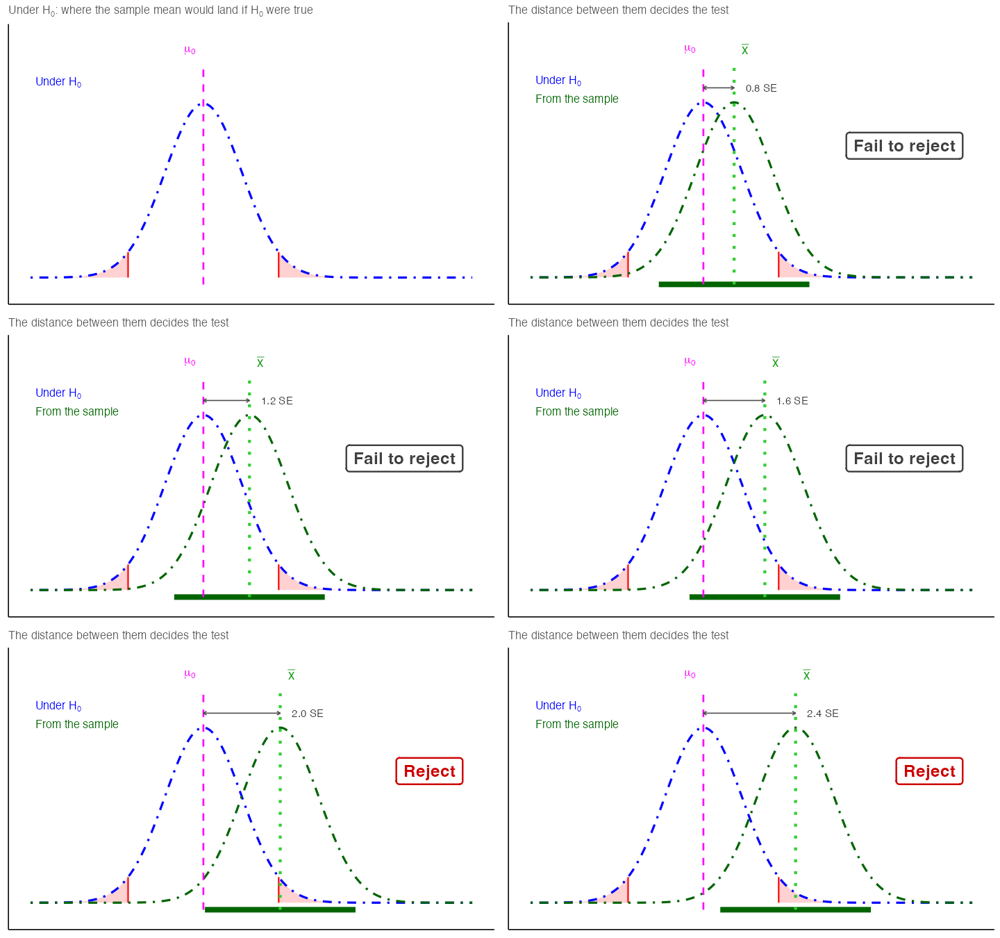
The previous chapter built the machinery of a hypothesis test and left you with a yes or no: reject \(H_0\), or fail to reject it.
Two questions remain. First, how often will that decision be wrong, and in which direction? Second, when we do reject, how large is the effect we found, and was the study ever capable of detecting it in the first place? This chapter answers both, then closes with how to report the answers.
5.1 Errors in Hypothesis Testing
Sometimes, even when we apply the test correctly, sampling variability can lead us to the wrong conclusion.
Type I Error (\(\alpha\)): Rejecting \(H_0\) when it is actually true. This is like a smoke alarm going off when there’s no fire: a false alarm. By convention, \(\alpha\) is often set at 0.05 (5%).
Type II Error (\(\beta\)): Failing to reject \(H_0\) when it is actually false. This is like a smoke alarm staying silent when there is a fire: a missed signal.
| Decision | If the null hypothesis is True | If the null hypothesis is False |
|---|---|---|
| Reject \(H_0\) | Type I error (prob = \(\alpha\)) | Correct (prob = 1 - \(\beta\)) |
| Fail to reject \(H_0\) | Correct (prob = 1 - \(\alpha\)) | Type II error (prob = \(\beta\)) |
Takeaway: As \(\alpha\) gets smaller, \(\beta\) gets bigger, and vice-versa.
Errors happen because samples are imperfect representations of the true population.
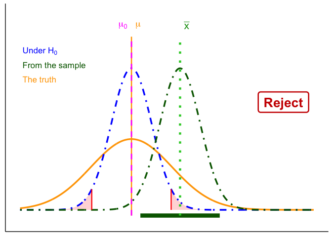
- In Figure 5.2, the true population mean (orange) is the same as \(\mu_0\). By chance, however, the sample mean lands far away, and the CI excludes \(\mu_0\). The test rejects \(H_0\) even though it is true: a Type I error.
- In Figure 5.3, the true population mean (orange) is far from \(\mu_0\), but the particular sample looks close to \(\mu_0\). The CI includes \(\mu_0\), so the test fails to reject when it should reject the null: a Type II error.
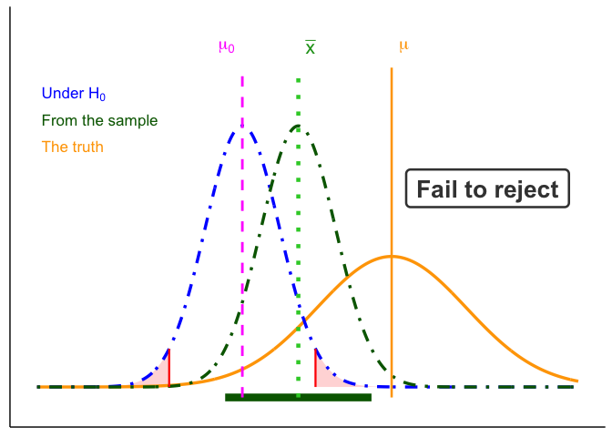
Those two figures show what a wrong conclusion looks like for one unlucky sample. They do not show how often it happens. The green curve in them is built from that one sample, centered on its \(\bar{x}\). To see how often an error happens, center the sampling distribution on a possible truth instead. That shows where the sample mean lands across all the samples we could have drawn.
Figure 5.4 does that. The blue curve is the sampling distribution of the sample mean under \(H_0\), the one that sets the critical values. The orange curve is the sampling distribution of the sample mean if \(\mu = \mu_a\). Chapter 4 drew the possible true populations under \(H_a\) as a family of curves sitting on either side of \(\mu_0\); \(\mu_a\) is the center of one of them, picked out and named so we can compute with it. It is not something we know. We choose a value and ask what would follow if that were the truth, and the answer depends on the value we choose. The larger the difference we ask about, the less likely the test is to miss it.
- \(\alpha\) is the red area in the tails of the blue curve, past the critical values. If \(H_0\) is true, that is how often the sample mean lands in the rejection region anyway.
- \(\beta\) is the gray area under the orange curve between the critical values. If \(\mu = \mu_a\), that is how often the sample mean fails to reach the rejection region and a real difference goes undetected.
- Power, \(1-\beta\), is the rest of the orange curve, the part past the critical values.
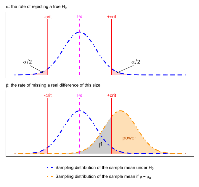
In Figure 5.4, \(\mu_a\) sits 2.5 standard errors above \(\mu_0\), which leaves \(\beta = 0.29\) and power \(= 0.71\): this design misses a real difference of that size in almost three tries out of ten. Slide the orange curve further right, meaning a larger real difference, and the gray area shrinks. Move the red lines outward, meaning a smaller \(\alpha\), and the gray area grows. That is the tradeoff the table above states in words.
5.1.1 Effect of Sample Size on Errors
With fixed \(\alpha\) and correct assumptions, the long-run Type I error rate is \(\alpha\) for any \(n\). Sample size mainly affects Type II error: with small \(n\), the sampling distribution is wide, true effects are harder to detect, and \(\beta\) increases (power decreases). As \(n\) grows, the sampling distribution tightens, \(\beta\) falls, and power rises. Apparent changes in the Type I rate at small \(n\) usually reflect assumption violations (e.g., non-normality, poor variance estimates, multiple looks), not \(n\) itself.
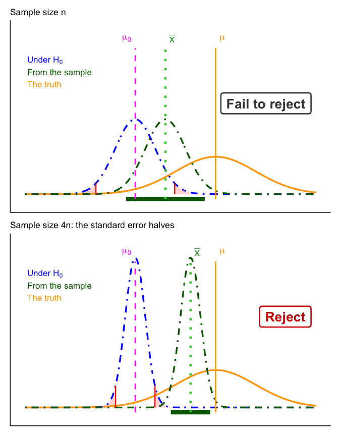
The one-tailed cost, made precise. Chapter 4 said to choose the tail before you see the data. That’s because picking it afterward makes you reject more often than your stated \(\alpha\) implies. A one-tailed test at \(\alpha = .05\) puts the whole 5% in one tail, so if you pick the tail after seeing which way the data went, you have effectively run a two-tailed test at \(\alpha = .10\) and doubled your Type I error rate. A one-tailed test with its direction chosen in advance keeps the Type I error rate at \(\alpha\).
5.1.2 How to interpret \(p\)-values
A \(p\)-value is the probability, assuming \(H_0\) is true, of obtaining a test statistic at least as extreme as the one we observed. We reject at level \(\alpha\) when \(p<\alpha\).
Tails. Count only the tail or tails that \(H_a\) points to: both tails for a two-tailed test, one tail for a one-tailed test.
CautionWarning: Common mistakes to avoid
- \(p\) is not the probability that \(H_0\) is true.
- A tiny \(p\) is not “super significant.” It means the data would be very unlikely if \(H_0\) were true, and that is all. The effect itself can still be tiny and not worth acting on, especially with a large \(n\). Report an effect size and a CI so a reader can judge whether it matters.
- With small \(n\), true effects can yield large \(p\) (low power).
5.2 Beyond the 0.05 Cutoff
A yes/no at \(\alpha=0.05\) is not enough, because scientists, managers, policymakers, and communities need to know how large an effect is and how likely a study is to detect it. Effect size and power answer those two questions.
Working definitions
Statistical significance: the result is unlikely under \(H_0\), at your chosen \(\alpha\).
Practical significance: the effect is large enough to change what someone does about it. This is a judgment about the world, not a calculation. With a large enough \(n\), a result can be statistically significant and practically trivial. With too small an \(n\), a result can be practically important and still not statistically significant.
Effect size: how big the result is, not just whether it cleared the threshold.
Power (\(1-\beta\)): the probability your design will detect a real effect of a specified size at your chosen \(\alpha\).
Use them before you sample. Decide what effect is meaningful for your context (e.g., a 0.3 mg/L nitrate reduction) and size your study to have adequate power to detect that effect.
5.3 Effect Size
Effect size comes in two kinds of units. You can express it in original units, which carry practical meaning, or in standardized units, which let you compare across scales.
Practical (original units). Use the scale stakeholders recognize.
- Exams: “Treatment improved scores by 5 percentage points” (a letter-grade-sized change).
- Time-on-task: “New training reduces practice time by 1,000 hours out of 10,000” (a 10% reduction).
These statements are easy to interpret, but they are hard to compare across contexts or measures.
Standardized (unitless). When units are unfamiliar or scales differ, standardize by typical variability. The most common standardized effect size metric is Cohen’s d (Cohen 1988). It divides the raw difference, \(\Delta\), by the population standard deviation:
\[d = \frac{\Delta}{\sigma}\]
\(\Delta\) is \(\mu_1 - \mu_2\) when comparing two groups, or \(\mu - \mu_0\) when testing one mean against a reference value. Now “how big?” is expressed in SD units.
This is the same ratio as a test statistic, with one part swapped. Chapter 4 gave the general shape, effect over error, and filled it in with the \(z\):
\[z = \frac{\bar{x}-\mu_0}{\sigma/\sqrt{n}} \qquad \text{versus} \qquad d = \frac{\mu_1-\mu_2}{\sigma}\]
The numerator is the same: the effect. The denominator differs. The test statistic divides by the standard error, which shrinks as \(n\) grows, so \(z\) gets larger with more data even when the effect stays exactly the same. Cohen’s \(d\) divides by the standard deviation, which does not shrink with \(n\), so \(d\) reports the size of the effect itself.
That is why a large test statistic does not mean a large effect, and why the two numbers answer different questions. Collect enough data and you can drive \(z\) as high as you like off a trivial difference. You cannot do that to \(d\). The next chapter’s \(t\) slots into exactly the same place: it is the same ratio with an estimated \(s\) in place of a known \(\sigma\), so the same argument applies to it unchanged.
Environmental example (biodiversity index). Suppose an index increases from 3 to 4 after reforestation.
In raw units: +1 index point.
In standardized terms:
- If the SD across sites is 1.0, then \(d = 1.0\): a large shift.
- If the SD is 10, then \(d = 0.10\): a small shift.
Planning uses \(\Delta\). To plan a study, \(\Delta\) is enough: it is the size of the effect you expect to see, in the units of the study, and there is no need to standardize it. Cohen’s \(d\) standardizes it so that effect sizes can be compared across studies.
Notes for practice
- In real data, \(\sigma\) is unknown; estimate it (pooled SD for two groups, with small-sample corrections as needed).
- Heuristics (context matters): \(d \approx 0.2\) (small), \(d \approx 0.5\) (medium), \(d \approx 0.8\) (large).
- A “small” \(d\) can still be important (e.g., small reductions in lead or \(\mathrm{PM}_{2.5}\) can matter for health).
- Pair effect sizes with 95% CIs to show precision, not just magnitude.
Suppose we’re measuring final exam performance (percent correct). The class mean is 65% with a standard deviation of 5%. Group A is a control, while Group B receives some instructional treatment.
Figure 5.6 shows four possible scenarios:
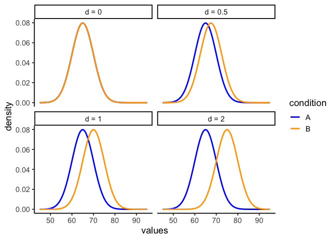
- Panel 1 (\(d=0\)): No effect. Both groups sample from the same distribution (mean = 65).
- Panel 2 (\(d=0.5\)): Group B’s mean shifts upward by 2.5 points (67.5).
- Panel 3 (\(d=1\)): A 5-point shift (70).
- Panel 4 (\(d=2\)): A large 10-point shift (75).
Effect size puts raw differences on a standard-deviation scale. A half-SD shift (\(d=0.5\)) is noticeable but modest; a two-SD shift (\(d=2\)) is very large. In practice, we rarely know beforehand how big a shift to expect.
5.4 Power
When a real effect exists, your design needs to be sensitive enough to detect it, otherwise the test has little value. We’ve already seen that effects can vary in size. Study designs also differ in how reliably they detect those effects. This sensitivity is called statistical power.
Power rises when:
- Effect size is larger.
- Sample size (\(n\)) is larger (smaller \(SE\)).
- The test is less conservative (larger \(\alpha\)).
- Measurement noise is lower (smaller \(SD\)).
That raises the practical planning question: with \(\alpha\) fixed at 0.05, how large must \(n\) be to reach 80% power for the smallest effect that matters? Figure 5.8 answers it for one such effect.
5.4.1 Simulation walkthrough
Let’s see how design choices affect power with a simple simulation. Suppose we have two groups, each with \(n=10\). Group A (control) is sampled from a normal distribution with mean = 10 and \(SD = 5\). Group B (treatment) has a mean = 12.5, a shift of 2.5 points (Cohen’s \(d=0.5\)), considered a medium effect.
If we simulate this experiment 1,000 times and run an independent-samples \(t\)-test each time, how often do we reject \(H_0\) at \(\alpha=0.05\)?
set.seed(2025)
p <- numeric(1000)
for(i in 1:1000){
  A <- rnorm(10, 10, 5)
  B <- rnorm(10, 12.5, 5)
  p[i] <- t.test(A,B,var.equal=TRUE)$p.value
}
power_n10 <- mean(p < 0.05)
This proportion is the power of the design: the probability of detecting the true effect in repeated experiments. Here it comes out at about 21%. Even though we know a medium-sized effect exists, the test usually fails to pick it up with such a small sample.
5.4.2 How power changes
- Larger \(n\). Doubling to \(n=20\) per group reduces sampling error and roughly doubles power:
p <- numeric(1000)
for(i in 1:1000){
  A <- rnorm(20, 10, 5)
  B <- rnorm(20, 12.5, 5)
  p[i] <- t.test(A,B,var.equal=TRUE)$p.value
}
power_n20 <- mean(p < 0.05)
That lifts power to about 33%, roughly double what \(n=10\) gave.
- Smaller \(\alpha\). Making the test more conservative (e.g., \(\alpha=0.01\)) lowers power, because fewer outcomes count as “significant”. Using the same \(n=20\) simulations, we just change the cutoff:
power_n20_strict <- mean(p < 0.01)Power falls to about 12%.
- Bigger effects are easier to detect. If the treatment produces a big shift (say 2 standard deviations), the same design at the same \(\alpha=0.01\) has near-perfect power:
p <- numeric(1000)
for(i in 1:1000){
  A <- rnorm(20, 10, 5)
  B <- rnorm(20, 20, 5)   # 2SD effect
  p[i] <- t.test(A,B,var.equal=TRUE)$p.value
}
power_big <- mean(p < 0.01)
Power is now about 100%: a difference that large is almost impossible to miss, even with 20 samples per group and a strict cutoff.
5.4.3 Power curves
It’s best to think of power as a profile, not a single number. A power curve shows how sensitive a design is across a range of possible effects.
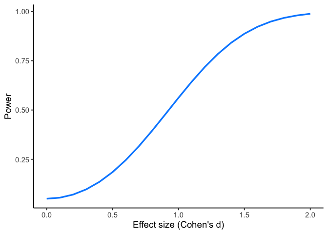
In Figure 5.7, we fix the design to a two-sample \(t\)-test with \(n=10\) per group and \(\alpha=0.05\). Power is plotted on the y-axis, and the true effect size (Cohen’s \(d\)) is on the x-axis.
Walkthrough.
- With \(n=10\), the design only detects a medium effect (\(d=0.5\)) about 18% of the time. This is the same quantity the simulation above estimated at about 21%. The two differ because 1,000 repetitions give an estimate, not an exact answer; the curve is computed exactly.
- A larger effect (\(d=0.8\)) is caught about 40% of the time.
- Very large effects (\(d=2\)) are detected almost every time (about 99%).
This shows that small samples can reliably detect only large effects.
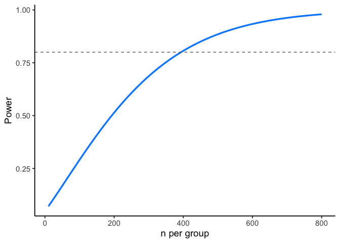
Now suppose prior research suggests the effect size is small (\(d=0.2\)). Instead of varying the effect, we can ask: how many samples per group do we need to have decent power?
Figure 5.8 plots power against sample size for detecting \(d=0.2\). The dashed line marks 80% power, a common planning target.
Walkthrough.
- At \(n=10\) per group, power to detect \(d=0.2\) is near zero.
- To reach 80% power, we need about 394 per group.
- Even then, 20% of studies would still fail to reject \(H_0\) just by chance.
Takeaway:
- A power curve shows, for a fixed design, how power rises as the true effect grows.
- A power-vs-\(n\) curve shows how many samples you need to hit a target power for a specific effect.
- Power analysis is mainly a planning tool, not a results-reporting tool. When you design a study, don’t just aim for “power = 0.8.” Always state the assumed effect size and the standard deviation you used for that calculation. Otherwise, “0.8” has no meaning: power depends entirely on those assumptions.
5.4.4 Planning your design
Planning a study means working through the following, in order:
- Define a meaningful effect, \(\Delta\): the smallest difference from \(\mu_0\) that would change what you do. State it in the units of the measurement.
- Choose \(\alpha\) (often 0.05; justify if different).
- Estimate variability, \(\sigma\) (pilot data, literature, or historical monitoring). With \(\Delta\) and \(\sigma\) you have \(d\), which is what a power calculation needs.
- Compute \(n\) for \(\ge 80\%\) power (or explain tradeoffs if you can’t reach it).
- Pre-specify one- vs two-tailed before data collection.
NoteWhen you actually do this
This sequence is a formal power analysis, and it is for a study you are about to run: one where you still control how much data you collect, and where collecting it costs something. How many plots to establish, how many sites to add to a monitoring network, how many samples a permit application commits you to. There the five steps are a real obligation, and funders, agencies and review boards often ask to see them.
A great deal of environmental work, including your project for this course, starts from data someone else already collected. You are working with the \(n\) you have, so there is no power calculation to do. What you owe a reader then is different: report the effect and its interval, and say plainly what a design this size could and could not have detected.
What you should not do is run the calculation backwards once the data are in, reporting the power you “had” to detect the effect you happened to observe. That is post-hoc power. The number is uninformative, because it is a direct restatement of your \(p\)-value: a non-significant result always has low observed power, by arithmetic. The harm is in what it gets used for, which is to argue that a null result was “inconclusive rather than negative.” That reasoning is circular, since the low power was guaranteed the moment the result came out non-significant. Asking what power you would have had against an effect size you specified in advance is a different question, and a fair one at any point.
As a general rule of thumb, small-\(n\) designs can only reliably detect very large effects, whereas large-\(n\) designs can reliably detect much smaller effects. Plan the design so it can reliably detect the effects it is meant to measure.
5.4.5 Two cautions (common pitfalls)
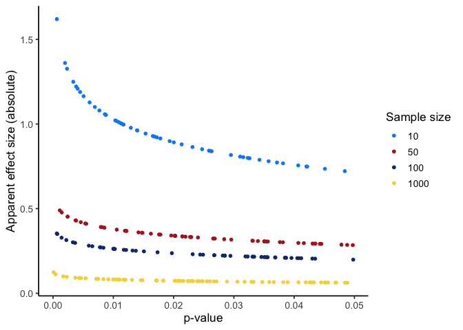
Low power inflates doubt, even when \(p<0.05\). Underpowered studies rarely replicate. A design with only 30% power to detect an expected effect might, by luck, produce a “significant” result, but most replications will not. Worse, false positives from small samples tend to look exaggerated: if a spurious finding reaches significance, the estimated effect size is often large enough to seem convincing.
Huge \(n\) finds tiny effects. With very large samples, trivial differences can register as statistically significant. For example, a satellite image can contain millions of pixels, so a difference of a fraction of a percent in greenness between two land-cover types can come out statistically significant. That difference is “real” but practically meaningless. Significance alone is not enough. This is why effect size and confidence intervals should be reported alongside \(p\)-values.
Figure 5.9 shows the first pitfall graphically. Even when the null hypothesis is true, 5% of tests are expected to fall below \(\alpha = 0.05\). In small samples, those false positives tend to be paired with large apparent effect sizes. What looks like a strong finding could just be sampling error.
5.5 Reporting Results
A results statement gives the plain-language conclusion and the key statistics in a fixed order. Aim for one clean sentence plus context.
Template (two-sided test): Plain-language finding. (test, statistic, df or n, value of statistic, p-value, effect size/CI if relevant).
What to include (in order):
- Test name (e.g., one-sample z, two-sample t, χ², regression).
- Test statistic and its degrees of freedom (or sample size for z).
- Exact \(p\) (report \(p<0.001\) when very small).
- An effect size and/or a 95% CI when available.
Examples
One-sample z: The average mercury level within 10 km of the smelter was higher than the legal limit (z = 2.85, n = 32, p = 0.004).
One-sample t with CI: Mean nitrate exceeded the target by 0.41 mg/L (t(31) = 2.6, p = 0.013, 95% CI [0.09, 0.73] mg/L).
Two-sample t with effect size: Downstream sites had higher turbidity than upstream sites (t(58) = 3.1, p = 0.003, Cohen’s d = 0.80).
Not significant (be explicit): Mean canopy temperature did not differ from the baseline (t(47) = 1.2, p = 0.24); we fail to reject \(H_0\).
Rounding & style
- Round statistics to 2 decimals; \(p\) to 3 decimals (use \(p<0.001\) when needed).
- Use “fail to reject \(H_0\)” (not “accept”).
- Match tail to hypothesis in prose (e.g., “higher than,” “lower than,” or “different from”).
Do / Don’t
- Do pair the sentence with a short, substantive takeaway (what it means for the question).
- Do include a CI or effect size when it aids interpretation.
- Don’t restate methods; don’t claim proof; don’t omit units.
5.6 Chapter Summary
Why it matters. A test result on its own is a yes or a no. This chapter is about everything that yes or no leaves out: how often the decision is wrong, how large the effect actually is, and whether the study was ever built to detect it.
Core ideas
- Two ways to be wrong. A Type I error rejects a true \(H_0\), at a rate you set with \(\alpha\). A Type II error fails to reject a false one. Tightening one loosens the other, which is why \(\alpha = .05\) is a balance rather than a fact about nature.
- What a \(p\)-value is not. It is not the probability that \(H_0\) is true, and on its own it says nothing about how large an effect is.
- Significance is not size. With a large enough \(n\), a trivially small difference clears any threshold. Report an effect size and a confidence interval next to every \(p\)-value so a reader can judge whether the result matters, not just whether it cleared a line.
- Effect size in two kinds of units. The same difference can be written in original units, \(\Delta\), which carry practical meaning for the people who act on your result, or in standard deviations, Cohen’s \(d = \Delta/\sigma\), which makes results comparable across studies and scales. These are one quantity in two units, not two quantities. Report both when you can, and plan in \(\Delta\), because the smallest difference worth detecting is a judgment made in real units.
- Power is a design decision. Power depends on \(n\), effect size, \(\alpha\), and variability together. An underpowered study fails twice over: it usually misses real effects, and when it does reach significance the effect it reports tends to be inflated. That is why power analysis belongs before data collection.
- Report a result as a sentence. State the direction in words, then give the test, the statistic with its df or \(n\), the \(p\)-value, and an effect size or confidence interval. “Significant” on its own tells a reader nothing about direction, magnitude, or precision.