| scores | x | y | x_squared | y_squared | xy |
|---|---|---|---|---|---|
| 1 | 1 | 2 | 1 | 4 | 2 |
| 2 | 4 | 5 | 16 | 25 | 20 |
| 3 | 3 | 1 | 9 | 1 | 3 |
| 4 | 6 | 8 | 36 | 64 | 48 |
| 5 | 5 | 6 | 25 | 36 | 30 |
| 6 | 7 | 8 | 49 | 64 | 56 |
| 7 | 8 | 9 | 64 | 81 | 72 |
| Sums | 34 | 39 | 200 | 275 | 231 |
9 Simple Linear Regression
Essentially, all models are wrong, but some are useful.
George E. P. Box
Back in Chapter 2, we used the covariance between two variables to quantify the strength and direction of a relationship (Pearson’s \(r\)), and fit a best-fit line through a scatterplot. We could not yet ask the inference question every other test in this book has asked:
Could chance alone plausibly have produced our result?
Now that we’ve learned hypothesis testing, sampling distributions, and the logic of comparing an observed statistic to a null distribution, we can apply that same logic to the regression line and test whether a given slope is evidence of a real relationship.
9.1 Regression Basics
The equation for a linear regression will be familiar, and it’s one of the most heavily used equations in applied science:
\(y = \beta_0 + \beta_1 x + \varepsilon\)
Slope term: \(\beta_1\)
Intercept term: \(\beta_0\).
A linear equation, fit to real data, is a statistical model. We never observe \(\beta_0\) or \(\beta_1\) directly. Real data also do not fall exactly on a line, so the model needs one more term, the error \(\varepsilon\): the variability in the DV that the population line doesn’t explain.
9.1.1 Computing the best-fit line by hand
In practice, we let software identify the line with the smallest total squared error, but working through one example by hand shows where that line actually comes from. Here are the “easy” formulas for the slope and intercept, calculated straight from the data:
\(intercept = b_0 = \frac{\sum{y}\sum{x^2}-\sum{x}\sum{xy}}{n\sum{x^2}-(\sum{x})^2}\)
\(slope = b_1 = \frac{n\sum{xy}-\sum{x}\sum{y}}{n\sum{x^2}-(\sum{x})^2}\)
Here \(x\) and \(y\) are the individual scores. This is the same line from Figure 2.11 in Chapter 2. To find its slope and intercept, we start with this table:
The table has 7 pairs of \(x\) and \(y\) scores, plus columns for \(x^2\), \(y^2\), and \(xy\) (each \(x\) score times its matching \(y\) score), with column sums at the bottom. These sums are everything the formulas need:
\(intercept = b_0 = \frac{\sum{y}\sum{x^2}-\sum{x}\sum{xy}}{n\sum{x^2}-(\sum{x})^2} = \frac{39 * 200 - 34*231}{7*200-34^2} = -.221\)
\(slope = b_1 = \frac{n\sum{xy}-\sum{x}\sum{y}}{n\sum{x^2}-(\sum{x})^2} = \frac{7*231-34*39}{7*200-34^2} = 1.19\)
With \(b_0\) and \(b_1\) in hand, we can compute a residual for any observed point: the difference between what we observed and what the line predicts, \(e = y - \hat y\), where \(\hat y = b_0 + b_1x\). For the first row above (\(x=1, y=2\)): \(\hat y = -.221 + 1.19(1) = .969\), so \(e = 2 - .969 = 1.031\). That point sits above the line. Repeating this for every point, then squaring and summing the residuals, gives the quantity that \(b_0\) and \(b_1\) were chosen to minimize. The residual \(e\) is the sample’s version of the error \(\varepsilon\). The error \(\varepsilon\) belongs to the population line, which we never see, and the residual \(e\) belongs to the line we fit.
Parameters and sample statistics
The beta coefficients in the model are population parameters. Like other population parameters, they belong to a population distribution that we infer but never know for certain.
| Symbol | What is it? | Do we know it? |
|---|---|---|
| \(\beta_0, \beta_1\) | True population intercept and slope | Almost never known for sure |
| \(b_0, b_1\) | Sample intercept and slope | Yes, calculated by fitting the line to our data |
Drawing the best-fit line through our data gives a sample slope, usually written \(b_1\).
9.2 Worked regression example: stream temperature and dissolved oxygen
Let’s work through an example. Warmer water holds less dissolved gas, so ecologists expect dissolved oxygen (DO) to decline as stream temperature rises. This matters for stream health: low DO can stress or kill fish and invertebrates. Figure 9.1 lays out the design. Unlike the designs in earlier chapters, the predictor here is continuous.
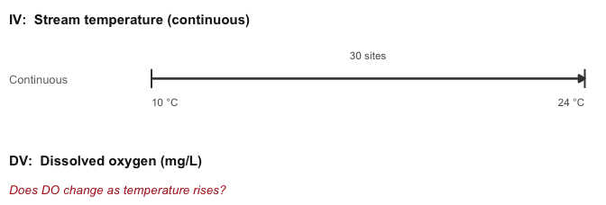
Up to now every design put units into groups and asked whether the groups differed. Now, with a continuous predictor, every temperature value is treated as its own group: each of the 30 sites sits somewhere along the range, and the line describes how mean DO changes from one temperature to the next. The question becomes how much DO changes per degree rather than whether two groups differ.
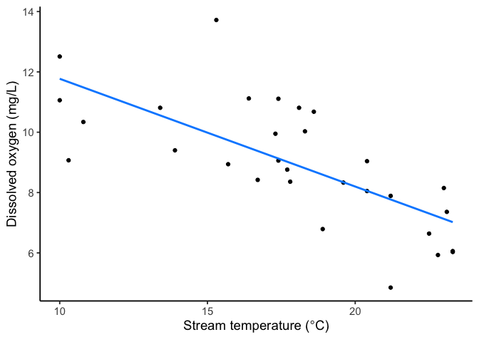
The scatterplot in Figure 9.2 shows a clear downward trend. Just from the graph, we can guess a couple of things:
Pearson’s \(r\) should be negative, since DO falls as temperature rises
It should sit fairly close to \(-1\) since the points hug the line with only modest scatter.
Before now, we could compute \(r\) but had no way to test whether an \(r\) that size is more than chance would produce. Regression adds that test by writing the observed relationship as a model.
9.2.1 The regression model
We model dissolved oxygen as a linear function of stream temperature, plus error:
\[DO = \beta_0 + \beta_1(\text{Temperature}) + \varepsilon\]
\(\beta_0\) is the population intercept, \(\beta_1\) is the population slope, and \(\varepsilon\) is the error, the part of DO that temperature alone doesn’t explain.
We don’t know \(\beta_0\) and \(\beta_1\); we estimate them from the sample as \(b_0\) and \(b_1\), using the same least-squares logic from Chapter 2 (the line that minimizes the sum of squared residuals).
In R, this is a single line of code:
fit <- lm(DO ~ stream_temp, data = stream_df)This fitted line (Figure 9.3) is the best-fit line that minimizes the total squared distance between the data and the line.
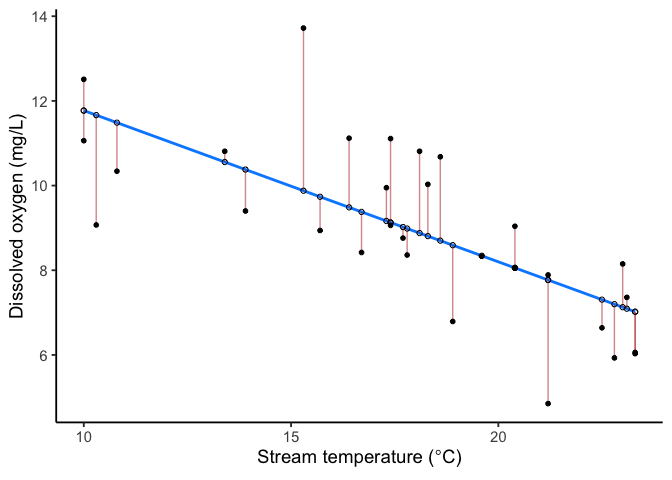
Here’s the table of model coefficients R gives us.
| Term | Estimate | Std. Error | t | p | CI low | CI high |
|---|---|---|---|---|---|---|
| (Intercept) | 15.34 | 1.23 | 12.47 | < .001 | 12.82 | 17.87 |
| stream_temp | -0.36 | 0.07 | -5.30 | < .001 | -0.50 | -0.22 |
With the results of the regression, we can get an equation for the fitted line:
\(\widehat{DO} = 15.34 - 0.36 \times \text{Temperature}\).
The hat over \(DO\) marks it as a predicted value, what the model outputs for a given temperature, as distinct from an actually observed \(DO\) measurement.
In the coefficient table, the Estimate values for the intercept and slope are \(b_0\) and \(b_1\), not \(\beta_0\) and \(\beta_1\). Recall this line is our model’s estimate from this one sample, not the true population line, which we never actually observe.
The intercept (\(b_0 = 15.34\)) is the model’s predicted DO at 0°C. That temperature is outside the range we sampled (10 to 24°C), so we won’t interpret the intercept.
The slope (\(b_1 = -0.36\)) is the part we care about most: for every 1°C increase in stream temperature, predicted dissolved oxygen drops by about 0.36 mg/L.
9.3 Testing the slope
The slope \(b_1\) is a sample estimate. Recall the hypothesis test asks whether the population slope \(\beta_1\) could plausibly be zero:
\(H_0: \beta_1 = 0\) (no linear relationship between stream temperature and dissolved oxygen)
\(H_a: \beta_1 \neq 0\) (there is a linear relationship)
Like any other statistic, \(b_1\) varies from sample to sample. If we drew a new sample of streams and fit a new line, we’d get a slightly different \(b_1\), just by chance. The test asks whether our \(b_1\) is large relative to that sampling variability, the same signal-over-noise pattern as every test so far:
\[\text{statistic}=\frac{\text{effect}}{\text{error}}.\]
This \(t\)-test for the regression slope, unlike the tests in earlier chapters, doesn’t need a separate function call: lm() computes it automatically the moment you fit the model. You get the whole coefficient table, Std. Error, \(t\), and \(p\), all at once.
The test statistic divides the estimated slope by its standard error, the Std. Error column in the coefficient table above. The standard error measures how much \(b_1\) would vary from sample to sample if we repeated this study many times:
\[t = \frac{b_1}{SE(b_1)} = \frac{-0.357}{0.067} = -5.30\]
with \(df = n - 2 = 28\) (one degree of freedom spent estimating the intercept, one for the slope).
Where the \(p\)-value comes from. If temperature and DO were truly unrelated in the population, repeating this study many times would still produce a nonzero \(b_1\) just by chance, and a \(t\)-statistic that follows a \(t\)-distribution with \(df = 28\). Figure 9.4 shows that distribution, with the critical values marking the boundary of the most extreme 5% under \(H_0\), and our observed \(t\) marked against it.
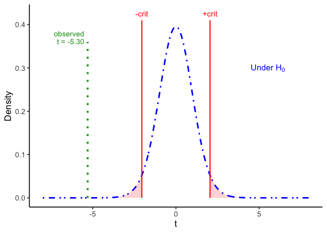
Our observed \(t = -5.30\) sits far past the critical values of about \(\pm2.05\), well outside where 95% of \(t\)-values would fall if temperature and DO were unrelated. The \(p\)-value is the probability of a \(t\) that far out (or farther) in either tail under \(H_0\): here, \(p< .001\). This crosses the conventional \(\alpha = .05\) threshold.
We reject \(H_0\): stream temperature is linearly related to dissolved oxygen.
The 95% confidence interval for the slope, also in the coefficient table above, is 95% CI [-0.495, -0.219] mg/L per °C. Because this interval does not contain 0, it agrees with the hypothesis test, as it always will.
9.4 Partitioning variation: regression as ANOVA
After fitting a linear regression model, you also need to know how well it fits. Does it do a good job of explaining changes in the dependent variable? We answer it the same way as one-way ANOVA in Chapter 8: split the total variation into a piece the model explains and a piece it leaves over.
Figure 9.5 shows the three pieces for the stream data. Every site’s distance from mean DO (left) splits into the distance from the mean to the line (middle), the part explained by the line, and the distance from the line to the point (right), the residual.
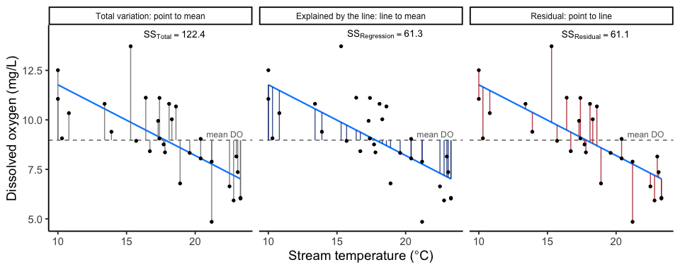
Squaring and summing each set of segments gives the partition:
\[SS_\text{Total} = SS_\text{Regression} + SS_\text{Residual}, \qquad 122.44 = 61.35 + 61.10\]
The pieces line up with Chapter 8’s. \(SS_\text{Regression}\) is the variation the predictor explains, the role \(SS_\text{Between}\) played for group means. \(SS_\text{Residual}\) is what’s left over around the line, the role \(SS_\text{Within}\) played around each group’s mean. Treating every temperature value as its own group means that the line supplies a predicted mean at each value of \(x\), in place of one mean per group.
R-squared is the proportion of the total variation explained by the line:
\[R^2 = \frac{SS_\text{Regression}}{SS_\text{Total}} = \frac{61.35}{122.44} = 0.50\]
It runs from 0 to 1, and it is the same quantity as \(\eta^2\) from Chapter 8. For simple regression with one predictor, \(R^2\) is also Pearson’s \(r\) from Chapter 2, squared: \((-0.708)^2 = 0.501\).
The regression ANOVA table. Dividing each sum of squares by its degrees of freedom gives mean squares, and their ratio is \(F\), exactly as in Chapter 8. The regression row uses 1 degree of freedom, one slope; the residual row uses \(n-2\), since the line estimated two things, an intercept and a slope.
| Source | df | SS | MS | F | p |
|---|---|---|---|---|---|
| stream_temp | 1 | 61.35 | 61.35 | 28.12 | < .001 |
| Residuals | 28 | 61.10 | 2.18 |
\[F = \frac{MS_\text{Regression}}{MS_\text{Residual}} = \frac{61.35}{2.182} = 28.12\]
With one predictor, \(F\) and the slope’s \(t\) test the same thing: \(F = t^2 = (-5.30)^2 = 28.12\), with the same \(p\). \(F\) is the form that generalizes to models with more than one predictor, which is why software reports both.
Here \(R^2 = 0.50\): stream temperature explains about 50% of the variation we observed in dissolved oxygen across sites. The remaining variation comes from everything else the model doesn’t capture (discharge, shading, groundwater input, and so on), and it shows up as the residuals.
ImportantResults reporting: regression
We report a regression result the same way as any other test: the slope with its confidence interval, the test statistic, degrees of freedom, and \(p\), plus \(R^2\) as the effect size.
Dissolved oxygen declined significantly with stream temperature, \(b_1 = -0.36\) mg/L per °C, 95% CI [-0.50, -0.22], \(t(28) = -5.30\), \(p < .001\), \(R^2 = 0.50\).
9.5 Consider both significance and effect size
As with all our tests, our significance test isn’t the whole picture. In addition to testing our slope (is \(\beta_1\) significantly different from 0?), we also consider \(R^2\), which is regression’s effect size.
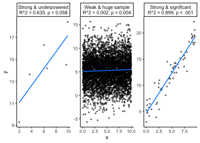
A significant slope does not guarantee a large \(R^2\), and a large \(R^2\) does not guarantee a significant slope.
A very large sample, the kind common in remote sensing and other big-data environmental work, can make a trivial effect statistically significant: more observations shrink the standard error until almost any nonzero slope clears \(p<.05\), no matter how little variance it explains.
A small sample tends to fail the opposite way, missing a real, sizeable effect because the standard error is too large for it to reach significance.
\(R^2\) tells you how much of the variation the line explains.
Because \(p\) and \(R^2\) answer different questions, we report both.
Figure 9.6 shows three of these combinations: a strong relationship with a non-significant slope (underpowered), a weak relationship with a significant slope (a large sample), and a relationship that is both strong and significant.
CautionWarning: How big is a “good” \(R^2\)?
It depends on the field. In studies of human behavior, where many unmeasured factors shape any outcome, 0.20 is a strong result. Environmental systems tend toward more direct physical relationships, so 0.5 to 0.8 for a well-chosen single predictor isn’t unusual. An \(R^2\) that looks too good, say 0.98 from a single predictor in a noisy field system, more often points to a problem in how the analysis was set up than to a real result.
9.6 Checking assumptions
Simple linear regression assumes:
Linearity: the true relationship between \(X\) and \(Y\) is a straight line.
Independence: each observation’s error is unrelated to the others’. This is the universal assumption from Chapter 6. Check it against the design: sites along the same stream, or repeated measurements over time, can violate it.
Constant variance (homoscedasticity): the spread of residuals is roughly the same across the whole range of \(X\).
Normality of residuals: the residuals are approximately normally distributed.
9.6.1 Sometimes the truth isn’t a line at all
You can do linear regression without thinking about whether the phenomenon you’re modeling is actually close to linear. But you shouldn’t.
Jordan Ellenberg, How Not to Be Wrong
A straight line is not guaranteed to be the right shape for your data. A residuals-versus-fitted plot checks two of the assumptions above at once: a curve means linearity is violated, and a funnel shape means constant variance is violated. The most useful diagnostic for catching either is a residuals-versus-fitted plot:
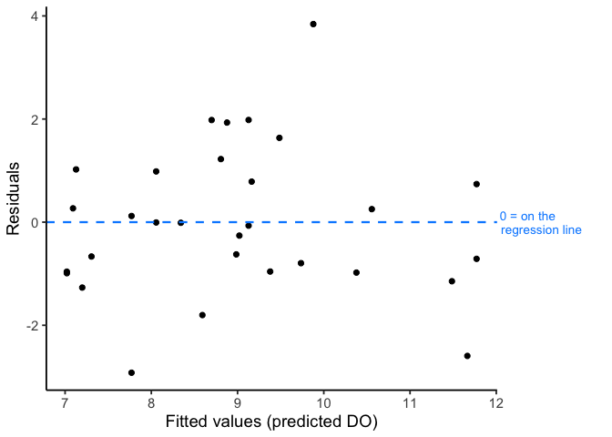
Figure 9.7, for our stream temperature data, shows what we want to see: residuals scattered evenly above and below zero, with no curve (which would suggest the true relationship isn’t linear) and no funnel shape (which would suggest variance changes systematically across the range of \(X\)).
Let’s try checking residuals for a different set of data, this time on avian influenza cases over time. The design is the same shape as the stream example, with time as the continuous predictor.
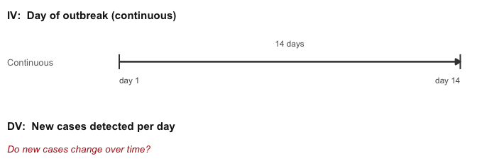
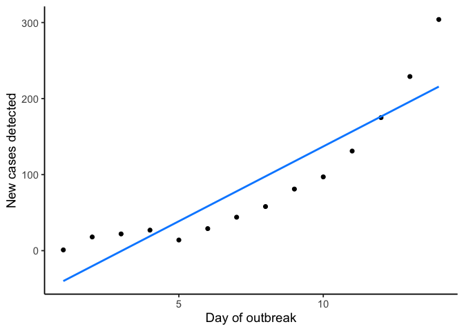
A straight line fit to these 14 days gives \(R^2 = 0.81\) and \(p< .001\), which by the benchmark in the “How big is a good \(R^2\)?” warning above looks like a solid, significant fit for a field system. Nothing about those numbers alone raises a flag.
Check the residuals. The residuals-versus-fitted plot shows a problem that the \(R^2\) and slope test did not.
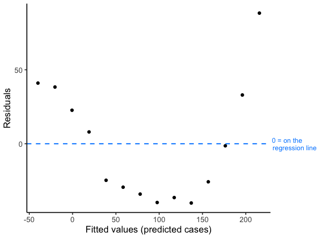
The U-shape is clear: the line underpredicts early and late in the outbreak and overpredicts in the middle, which is the pattern a straight line fit to a curve produces.
If a residual plot curves instead of scattering randomly, a straight line is the wrong model for the data.
Fixes typically include:
- a different model (often adding a polynomial term)
- a transformation, re-expressing a variable on a different scale so a straight line fits it (log-transforming a variable that grows multiplicatively, like the outbreak data above, is the most common case)
- or a nonlinear model entirely, beyond what this course covers
9.6.2 Checking normality
For normality, we check the residuals two ways: visually, with a Q-Q plot, and formally, with the Shapiro-Wilk test.
A Q-Q plot sorts the residuals and compares them to where a perfectly normal distribution would place values at the same percentiles. If the residuals are normal, the points fall close to the diagonal line; a systematic curve or S-shape means they don’t.
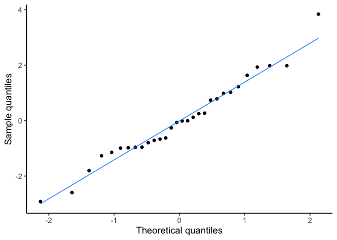
Figure 9.11 looks close to straight, consistent with normal residuals. Shapiro-Wilk asks the same question formally: \(H_0\) is that the residuals come from a normal distribution, so a small \(p\)-value is the evidence against normality.
| Statistic | p-value |
|---|---|
| 0.97 | 0.663 |
The residuals don’t depart from normality here (\(p = 0.663\)). As with any formal normality test, treat this as one piece of evidence alongside the Q-Q plot and residual plot, not a strict gate. Shapiro-Wilk has the least power to detect real departures when the sample is small, which is also when the visual checks matter most.
Now apply the same two normality checks to the avian influenza model, the one we already know is badly nonlinear.
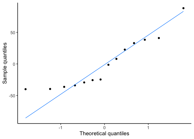
The Q-Q plot looks close to straight, and Shapiro-Wilk agrees (\(p = 0.060\), not significant). Both checks pass on a model we already know is the wrong shape. That is because they check normality of the residuals, which is a different assumption than linearity, and a model can badly violate linearity while its residuals still look roughly normal.
9.7 Using the model: prediction
Once we’ve confirmed a real linear relationship, the fitted equation lets us predict DO at any stream temperature. Plugging temperature into the fitted line directly gives the prediction: at 20°C,
\[\widehat{DO} = b_0 + b_1(20) = 15.34 + (-0.36)(20) = 8.20\]
R gives the same number, along with a confidence interval:
| Stream temperature | Predicted | CI low | CI high |
|---|---|---|---|
| 20 | 8.2 | 7.57 | 8.83 |
At 20°C, the model predicts DO of 8.20 mg/L, 95% CI [7.57, 8.83]. Because 20°C falls inside our sampled range of 10 to 24°C, this prediction is interpolation, which is what regression is good for. Predicting DO at, say, 35°C would be extrapolation: nothing in the data tells us the relationship stays linear (or even stays a relationship at all) beyond the range we actually observed, and the further outside that range, the less trustworthy the prediction. Figure 9.13 shows both zones on the same line.
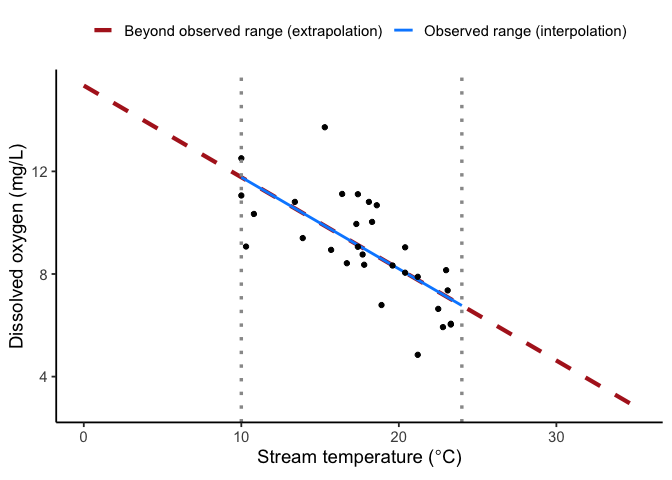
Regression is used for extrapolation all the time, and often reasonably: a well-understood physical process can justify projecting a line beyond the data you happened to collect. Extrapolating a straight line is only safe if the true relationship actually stays straight past the range you observed.
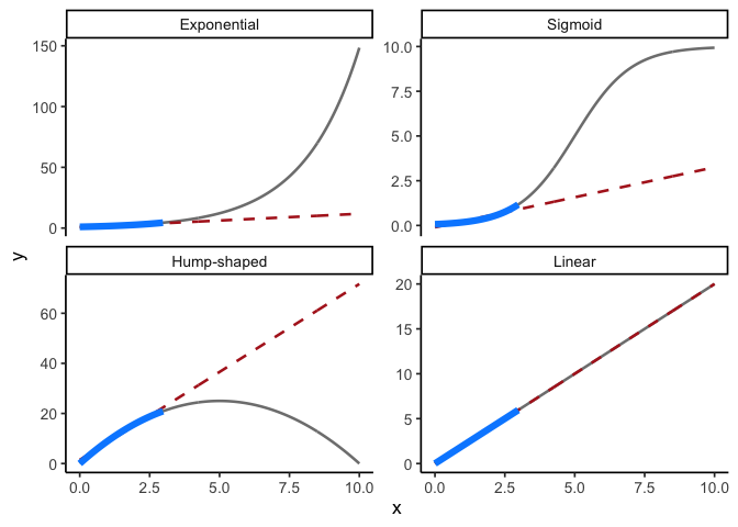
The problem is that a narrow window of data can’t tell you which kind of curve you’re actually on. Figure 9.14 shows four very different relationships, exponential growth, a sigmoid, a hump-shaped curve, and a truly straight line, each with the same short observed window highlighted in blue. In each panel a straight line (dashed red) is fit to that window and extended. Once you see the full curve (grey), you can see how badly linear extrapolation beyond the range of observed data would perform in each case.
Suppose officials use the linear fitted line from the outbreak example above to project avian influenza cases at day 30, well past the 14 days observed.
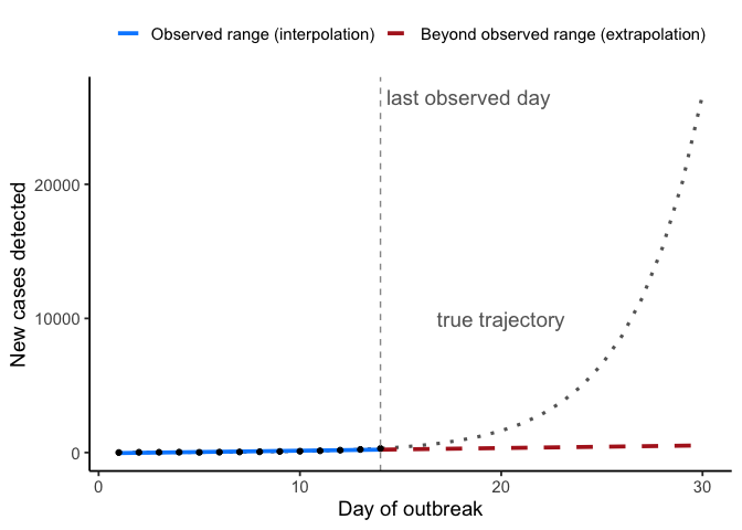
The linear model predicts about 530 cases on day 30. If the outbreak is exponential, the actual count is closer to 26,682, roughly 50 times higher.
Planning surveillance and containment staffing off the linear forecast would leave the response badly under-resourced for the outbreak that actually arrives. A straight line can look fine over a short early window and still be very wrong about where that window leads.
This problem calls for a different model. More data or a better-fitting straight line would not fix it. Fitting curves and transformations is beyond this course, but you can recognize when you need one by plotting the data and the residuals.
9.8 Chapter Summary
Why it matters. Chapter 2 drew a best-fit line through a scatterplot; this chapter turns that line into something you can test, quantify, and make predictions from.
Core ideas
- The slope can be tested. Chapter 2’s \(r\) described a relationship but came with no test of whether it was more than chance. Fitting a line turns that relationship into a model whose slope we can test: \(H_0: \beta_1 = 0\) says there is no linear relationship. Testing it uses a \(t\)-test on the slope divided by its standard error, with \(df = n-2\).
- Regression partitions variation the way ANOVA does. \(SS_\text{Total}\) splits into \(SS_\text{Regression}\) (Chapter 8’s between) and \(SS_\text{Residual}\) (Chapter 8’s within), and \(F = MS_\text{Regression}/MS_\text{Residual}\), which equals \(t^2\) with one predictor. \(R^2\), the proportion of variation explained by the line, is the effect size. A relationship can be real (\(p\) small) and still explain very little, which is why you report both.
- Look at your data, then look at your residuals. The assumptions that must be met are linearity, independence, constant variance, and roughly normal residuals. A residuals-versus-fitted plot catches violations a formal test can miss entirely, as the outbreak example showed.
- Predict inside your data; extrapolate beyond with caution. Interpolating within the observed range of \(x\) is what regression is for. Extrapolating beyond it is sometimes justified, but only when you have good reason to believe the relationship stays the same shape past the range you observed.
- A good \(R^2\) can still be the wrong model. The outbreak example fit a straight line to exponential growth and got \(R^2=0.81\), a residuals-versus-fitted plot that clearly curved, and an extrapolated forecast tens of thousands of cases short of reality. The residual plot catches this; a Q-Q plot, which checks a different assumption, does not.