11 Analysis of Covariance (ANCOVA)
We’ve now covered both regression and ANOVA. This chapter merges them:
\[\text{Regression} + \text{ANOVA} = \text{ANCOVA}\]
The last chapter compared macroinvertebrate species count across two discrete Pollution categories, present or absent, and two Flow categories, low or high. But suppose you measured each channel’s pollution concentration instead of labeling it present or absent.
Does Flow’s effect on species count still depend on pollution once pollution is treated as the continuous measurement it really is, rather than binned into two groups? (covariate: pollution concentration; factor: flow rate)
Does exposure to PFAS correlate with lifetime cancer incidence uniformly across low- and high-income American populations? (covariate: PFAS exposure; factor: income level)
Each question pairs a continuous relationship, a continuous variable’s effect on the outcome, with a categorical grouping. That pairing, one continuous variable and one categorical factor, is what makes a design an ANCOVA rather than a plain regression or a plain ANOVA.
The first question points to a limitation of the last chapter. “Pollution: present or absent” simplifies a continuous measurement, a concentration in parts per billion. Sorting continuous measurements into “high” and “low” buckets throws away exactly the information a covariate needs: how much more polluted, not just whether. Whenever you have the real numbers, ANCOVA (or, if there’s no categorical factor left at all, plain regression) is almost always the better tool than forcing them into groups first.
ANCOVA is a linear model built directly on regression’s own equation. A simple linear model is
\[y = \beta_0 + \beta_1 x + \varepsilon\]
Here \(\beta_0\) is the intercept, \(\beta_1\) is the slope, and \(\varepsilon\) is the error. The model describes a single line.
ANCOVA adds a categorical factor to that equation, and the whole chapter comes down to one question: does every group follow that same line, or does each group need its own slope and intercept?
We answer it in order: first check that the model explains anything at all, then test whether the groups have different slopes, and only if the slopes are parallel, test whether the groups differ in adjusted means.
11.1 Why adjust for anything?
The cleanest illustration is a result called Simpson’s paradox, where a pattern in combined data reverses once you split the data into meaningful groups.
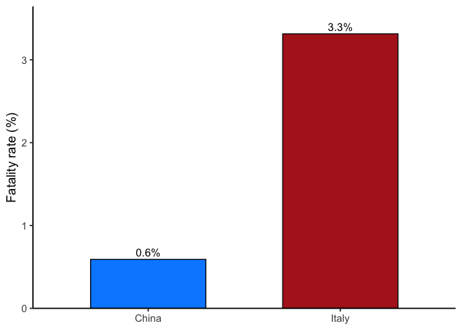
Here’s a recent example. During the COVID-19 pandemic, early data showed that Italy’s overall case fatality rate was higher than China’s. But once researchers disaggregated by age group, the trend flipped: within every age group, the fatality rate was higher in China. The apparent contradiction was explained by differences in the age distribution of cases (von Kügelgen et al. 2021).
Using case fatality rate (CFR), here are some illustrative numbers (made up for teaching).
At face value, Italy looks worse. Older people are much more likely to die from COVID than younger people, so we split cases into 10-year age bands. Within every band, China’s fatality rate is higher.
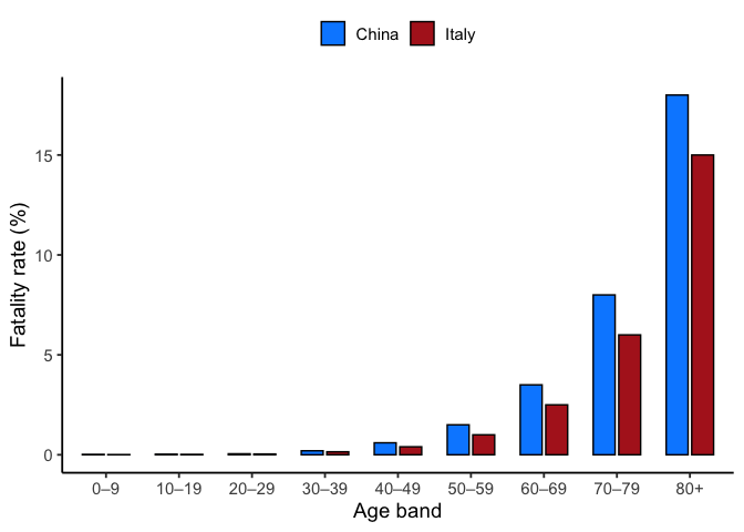
The reversal happens because Italy’s population skews older while China’s skews younger. Italy therefore had a greater proportion of older people getting sick, which pulls Italy’s overall average up. Similarly, China’s average is pulled down because a greater proportion of younger people are getting sick. Aggregating without adjusting for age hid the within-group pattern entirely.
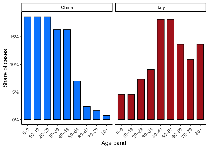
That reversal is not a trick or a data error. It happens because the groups differ in the composition of a third variable, and the combined number averages over that difference. Once you condition on the third variable, the within-group pattern shows up again.
ANCOVA handles this situation when the third variable is continuous, instead of grouped into categories like the age bands above. It compares groups while holding a covariate fixed, so a difference between the groups on that covariate does not distort the comparison.
11.2 Terminology
Covariate: a continuous variable that changes alongside the response and helps explain part of its variation. In environmental studies, common covariates include temperature, rainfall, soil moisture, or pollution concentration: factors that may influence the outcome but aren’t the main treatment of interest. Including one lets us adjust for its influence, giving a clearer test of the categorical effect once that continuous background variation is accounted for.
The categorical predictor itself, in every example this chapter uses, is what’s called a fixed factor: specific, intentional levels chosen by the researcher (urban vs. rural, shaded vs. open canopy), not a random sample of possible groups. That distinction matters more once you’re building mixed-effects models, which is beyond where this course goes. A random factor, by contrast, would be something like the counties your streams are in. You aren’t interested in those ten counties for their own sake. They represent a larger population of counties, and you want your conclusions to apply beyond the ones you sampled.
11.3 What ANCOVA Is
ANCOVA helps us answer: does a relationship hold up across groups? That framing fits environmental work particularly well, because you usually can’t experimentally strip out a covariate like temperature, rainfall, or season anyway. Often you wouldn’t want to. It may be the reason you designed the study in the first place. In this chapter’s main example, the covariate is what we care about and the interaction is the result we’re testing for.
CautionWarning: The other way you’ll see ANCOVA
Elsewhere the covariate is a nuisance instead: something you control for so a group comparison is fair. In that version, you test the interaction hoping it is not significant.
A classic version from psychology compares anxiety scores across two therapy groups after treatment, controlling for pre-treatment scores.
Both versions use the same test and the same math. They differ only in which term you came to interpret, so decide that before you fit anything. The second example at the end of this chapter works through this version.
For ANCOVA, you need:
- A continuous dependent variable (the response)
- At least one continuous independent variable (covariate)
- At least one categorical independent variable (a fixed factor, in this course)
11.3.1 Indicator variables and how they work
Before we can read real coefficients off an ANCOVA table, it helps to see exactly how one equation can represent two different groups at once.
Categorical predictors get into a linear model by being coded as indicator variables (you’ll also see them called dummy variables). For a factor with \(k\) groups you include \(k-1\) indicators; the omitted group becomes the reference, and every coefficient is interpreted relative to it. With two groups, one indicator does the whole job:
\[G = \begin{cases} 0 & \text{group 1 (the reference group)} \\ 1 & \text{group 2} \end{cases}\]
In R, lm(y ~ x + Group) creates these indicators for you automatically.
Indicator variables in action. When an indicator variable is turned on (set to 1), it activates the terms multiplied by that variable. Depending on where the indicator appears in the model, that can change the intercept, the slope, or both.
Consider two predictors: a continuous variable \(x\) and an indicator \(G\) (0 or 1). The numbers below are arbitrary, chosen to make the arithmetic clean; the worked example later in this chapter plugs in real coefficients for air pollution and area type. Use this model:
\[y = 2x + 1(x G) - 7G + 3\]
When \(G = 0\) (indicator off), only the baseline terms are active:
\[y = 2x + 3 \qquad \text{slope} = 2, \ \text{intercept} = 3\]
When \(G = 1\) (indicator on), the new terms activate:
\[y = (2x + 3) + (1x - 7) = 3x - 4 \qquad \text{slope} = 3, \ \text{intercept} = -4\]
Turning on the indicator adds +1 to the slope and −7 to the intercept. The one equation gives two different lines, and the value of the indicator decides which one applies.
This is how linear models represent different groups: the indicator (\(G\)) and its interaction with \(x\) let a single equation shift the intercept and the slope for each group. ANCOVA uses exactly this logic to test, in order, whether the slopes differ between groups (the \(x G\) term) and, if they don’t, whether the adjusted means differ (the \(G\) term).
Naming the pieces. Written in the general form, the same equation gives each coefficient a name and a meaning:
\[y = \underbrace{\beta_0}_{\text{reference intercept}} + \underbrace{\beta_1 x}_{\text{reference slope}} + \underbrace{\beta_2 G}_{\text{intercept shift}} + \underbrace{\beta_3 x G}_{\text{slope shift}} + \varepsilon\]
- \(\beta_0\) and \(\beta_1\) describe the line for the reference group (\(G=0\)).
- \(\beta_2\) is how much the intercept moves for the other group.
- \(\beta_3\) is how much the slope changes for the other group. This is the interaction term.
If we only include \(\beta_2\) and leave out \(\beta_3\), we get a restricted version: the intercept can shift but the slope cannot, so the two lines are forced to be parallel. That is the parallel-lines model, and it is the one we fall back to when the slope difference turns out not to be significant.
NoteNote: Why this matters
Every coefficient you will read out of an ANCOVA table is one of these four. If you don’t know how the indicator works, \(\beta_2\) and \(\beta_3\) are just numbers in R output. Once you do, each has a meaning you can check against a graph: \(\beta_3\) is the difference between the two groups’ slopes.
11.3.2 The steps of an ANCOVA
Model. For one covariate (\(x\)) and a two-level group indicator \(G\in\{0,1\}\),
\[y=\beta_0+\beta_1 x+\beta_2 G+\beta_3(x\times G)+\varepsilon\]
Figure 11.4 shows the three possibilities this model can produce.
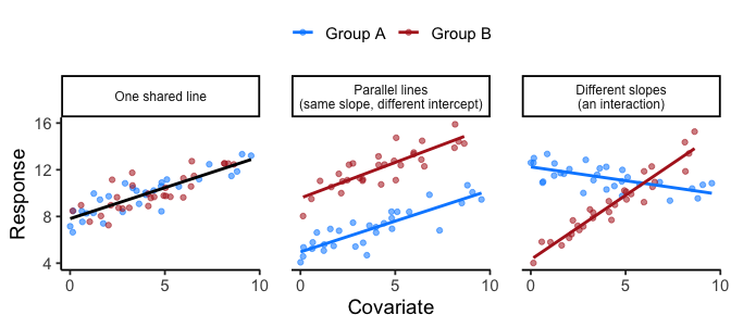
ANCOVA works right to left across that figure: first it asks whether the rightmost panel is what we have (do the slopes differ?), and only if the answer is no does it ask whether we have the middle panel or the leftmost (do the intercepts differ?).
Step 0: Does the model explain anything? Before looking at any single term, check the whole-model \(F\)-test, which asks whether the covariate, the group, and their interaction together explain more of \(y\) than chance would: \(H_0:\beta_1=\beta_2=\beta_3=0\). R reports it on the last line of summary(lm(...)). If it is not significant, stop. The data are one group with one mean and one variance, and no single term is worth interpreting.
Step 1: Are slopes equal across groups? This tests whether the covariate effect is the same in each group.
- Null: \(H_{0,\text{int}}:\beta_3=0\) (parallel lines, same slope)
- Alternative: \(H_{a,\text{int}}:\beta_3\neq 0\) (non-parallel lines, different slopes)
If Step 1 rejects. The slopes differ, so stop testing the group term. There is no single group difference to test, because the gap between the lines changes along the covariate. Describe each group’s line instead. The model gives both slopes (the reference group’s is \(\beta_1\), the other group’s is \(\beta_1+\beta_3\)), but it does not test whether each one differs from zero: a significant \(\beta_3\) says the slopes differ from each other, not that both are real. To test each slope, fit a separate simple regression within each group.
Step 2: Are adjusted means equal? (only if Step 1 retained parallel slopes) Drop the interaction and refit the parallel-lines model,
\[y=\beta_0+\beta_1 x+\beta_2 G+\varepsilon\]
- Null: \(H_{0,\text{group}}:\beta_2=0\)
- Alternative: \(H_{a,\text{group}}:\beta_2\neq 0\)
With parallel lines, \(\beta_2\) is the vertical gap between the two lines, and it is the same at every value of \(x\). That gap is the adjusted difference: how much the groups differ when they are compared at the same covariate value. Evaluating each group’s line at the overall mean of \(x\) gives the adjusted means, the group means you would expect if both groups had the same average covariate. The second example at the end of this chapter works through one.
What the parameters mean.
- \(\beta_1\): slope of \(y\) on \(x\) for the reference group; in the parallel-lines model, the common slope.
- \(\beta_2\): difference in intercepts; in the parallel-lines model, the adjusted difference between groups.
- \(\beta_3\): difference in slopes between groups.
Intercepts and centering. Intercepts are evaluated at \(x=0\). In the model with an interaction, the lines are not parallel, so \(\beta_2\) compares the groups at \(x=0\) only, which may be far outside the data. Centering the covariate, \(\tilde x=x-\bar x\), moves that comparison to the average covariate value. In the parallel-lines model the gap is the same everywhere, so centering changes the intercept but not \(\beta_2\).
What to report.
- If \(x\times G\) is significant: “The effect of \(x\) differs by group,” then each group’s line with its own slope test, and a figure with separate fitted lines.
- If \(x\times G\) is not significant: the common slope \(\beta_1\) and the adjusted group difference \(\beta_2\) (or the adjusted means), with a figure showing parallel lines.
As always, statistical significance doesn’t guarantee ecological or practical importance. Interpret a rejected null in light of the study’s design, measurement precision, and the actual size of the effect, not just its \(p\)-value.
Common pitfalls.
- Interpreting main effects when the interaction is significant.
- Comparing raw intercepts when \(x\) is not centered.
- Treating adjusted means as meaningful when slopes are not parallel.
11.3.3 Checking ANCOVA’s assumptions
Most of these are ones ANOVA already needed; two are new because a covariate has entered the model.
Independent observations (same as ANOVA)
Approximately normal residuals and similar variances across groups (same as ANOVA)
Linearity within each group: the covariate-response relationship is a straight line (new, about the covariate)
Homogeneity of slopes: the groups share that same line, unless the interaction test says otherwise (new, and this is the one the interaction test above directly checks, rather than a condition you verify beforehand)
The covariate is measured with minimal error and isn’t itself affected by the treatment (new, and more consequential here than in an ordinary regression. If the covariate is measured with error, ANCOVA only partly adjusts for group differences in the covariate, and the leftover difference can look like a treatment effect.)
11.4 Full ANCOVA Example
11.4.1 Question
Imagine we’re environmental scientists studying the impact of air pollution on bird species density, and we want to know whether that relationship differs between urban and rural areas. Figure 11.5 lays out the design.
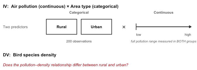
This design has the same structure as the factorial design in Chapter 10: both cross two predictors and ask whether one changes the effect of the other. The only difference is that factorial’s second predictor has levels, while ANCOVA’s is a continuous range. Note also that both groups span the full pollution range. Rural sites are not simply the clean ones, which is exactly what makes an adjusted comparison possible.
We might expect pollution to have a stronger negative effect in urban areas. Urban habitat is already fragmented and offers birds fewer clean patches to retreat to, while rural areas have more intact habitat nearby.
11.4.2 Model
We’ll fit an ANCOVA model to test whether air pollution’s relationship with bird density differs between urban and rural sites. Area type enters as an indicator variable, and air pollution enters as the covariate.
11.4.3 Null and Alternative Hypotheses in our example ANCOVA
First, we state the hypotheses for each step:
Whole model. Do air pollution, area type, and their interaction together explain bird density?
\(H_0: \beta_1=\beta_2=\beta_3=0\)
Slopes (interaction). Does air pollution affect bird density the same way at urban and rural sites?
\(H_{0,\text{int}}: \beta_3 = 0\) (parallel lines)
\(H_{a,\text{int}}: \beta_3 \neq 0\)
A significant interaction means the slopes differ, and air pollution’s relationship with bird density depends on area type.
Adjusted means (only if the slopes are parallel). At the same level of air pollution, do urban and rural sites differ in bird density?
\(H_{0,\text{group}}: \beta_2 = 0\)
\(H_{a,\text{group}}: \beta_2 \neq 0\)
11.4.4 Analysis
Before we look at the model results, it’s always good practice to look at the data first.
Let’s start with the response variable, bird density, in Figure 11.6. This gives us a quick visual sense of whether urban and rural areas differ in their average values.
ggplot(data, aes(AreaType, BirdDensity)) +
  geom_boxplot(aes(fill = AreaType), show.legend = FALSE) +
  labs(x = "Area Type", y = "Bird Density")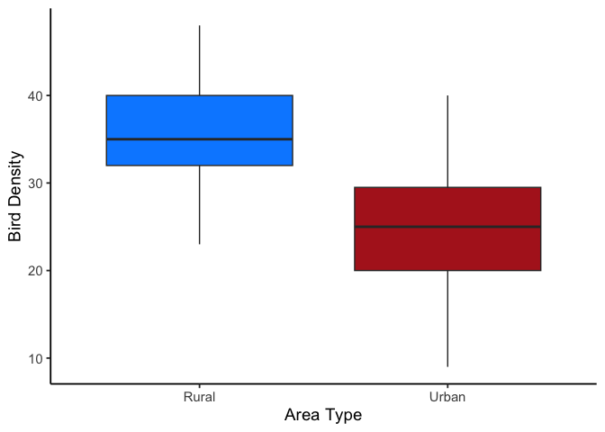
At first glance, bird density appears higher in rural areas than in urban ones, consistent with what we might expect ecologically.
Next, check the covariate, air pollution. If the covariate differs sharply between groups, ANCOVA will “adjust” for that difference. If it doesn’t, group comparisons will look more like a simple ANOVA.
ggplot(data, aes(AreaType, AirPollution)) +
  geom_boxplot(aes(fill = AreaType), show.legend = FALSE) +
  labs(x = "Area Type", y = "Air Pollution")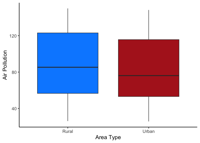
Air pollution looks fairly similar between urban and rural sites, with no obvious systematic difference. This plot doesn’t test anything, but it tells us what to expect: because pollution is similar in the two groups, a group difference in bird density is unlikely to come from a difference in pollution.
11.4.5 Results of the ANCOVA Model
Now that we’ve explored the data visually, we can test our hypotheses formally using ANCOVA.
Fit the model. This is the same aov() call we used for one-way and factorial ANOVA. R doesn’t need a special “ANCOVA function”: once AirPollution is numeric instead of a factor, aov() handles the continuous covariate automatically.
ancova <- aov(BirdDensity ~ AirPollution * AreaType, data = data)
| term | df | sumsq | meansq | statistic | p.value |
|---|---|---|---|---|---|
| AirPollution | 1 | 2183.89 | 2183.89 | 88.57 | 0.0000 |
| AreaType | 1 | 6450.54 | 6450.54 | 261.60 | 0.0000 |
| AirPollution:AreaType | 1 | 269.14 | 269.14 | 10.91 | 0.0011 |
| Residuals | 196 | 4833.03 | 24.66 | NA | NA |
Step 0: the whole model. summary(lm()) reports \(F(3, 196) = 120.36\), \(p < .001\), with \(R^2 = 0.65\). The model explains bird density, so we continue.
Step 1: the interaction. The AirPollution:AreaType row tests \(H_{0,\text{int}}\): \(F(1, 196) = 10.91\), \(p = .001\). Reject \(H_{0,\text{int}}\): the slopes are not parallel. Air pollution’s relationship with bird density depends on area type, so we stop here and do not test adjusted means.
What the other two rows are. The table still has rows for AirPollution and AreaType, both with tiny \(p\)-values, so it is tempting to read them. Don’t. R builds these rows in sequence: AirPollution tests one average slope for all 200 sites, ignoring area type, and AreaType tests a group difference after that single slope is fitted. Once the interaction says the slopes differ, neither row describes the data: there is no single slope, and the group difference depends on where along the pollution gradient you look. Because the rows are built in sequence and the groups are unequal in size (97 rural, 103 urban), listing the terms in a different order would also change their sums of squares.
Reading the coefficients.
We can also fit the same model using lm() to view the regression coefficients directly.
This shows how each term contributes to predicting bird density and corresponds to the hypothesis tests we just discussed.
ancova_lm <- lm(BirdDensity ~ AirPollution * AreaType, data = data)
| term | estimate | std.error | statistic | p.value |
|---|---|---|---|---|
| (Intercept) | 41.784 | 1.310 | 31.90 | 0.0000 |
| AirPollution | -0.069 | 0.014 | -5.07 | 0.0000 |
| AreaTypeUrban | -5.909 | 1.802 | -3.28 | 0.0012 |
| AirPollution:AreaTypeUrban | -0.064 | 0.019 | -3.30 | 0.0011 |
R automatically converts the categorical AreaType variable into a 0/1 indicator, the same \(G\) from the indicator-variable section earlier in this chapter. It picks one level (here, “Rural,” alphabetically first) as the reference, and every coefficient involving AreaType is interpreted relative to that reference. That’s why you see a coefficient called AreaTypeUrban but no separate AreaTypeRural term.
These coefficients give the direction and magnitude of each effect:
- (Intercept): estimated mean bird density for rural sites (the reference group) when air pollution is zero.
- AirPollution: slope of the relationship between pollution and bird density in rural sites. This is not the same quantity as the
AirPollutionrow of the ANOVA table above, which was one average slope for both groups. - AreaTypeUrban: difference in intercept between urban and rural areas.
- AirPollution:AreaTypeUrban: difference in slope between urban and rural areas (the interaction).
Visualize the interaction.
As always, plotting helps confirm what the model tells us.
A scatter plot with fitted regression lines (Figure 11.8) lets us see how air pollution relates to bird density for each area type.
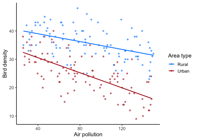
Here, the slopes differ by area type, illustrating the significant interaction we detected statistically. Both lines slope downward, so pollution is associated with fewer birds in both settings, but the urban line drops roughly twice as fast. The two lines start close together at low pollution and move apart as pollution rises.
Testing each group’s slope. The interaction told us the two slopes differ from each other. It did not tell us whether each one differs from zero, so we fit a separate simple regression within each group.
| Area type | Slope | SE | t | p |
|---|---|---|---|---|
| Rural | -0.069 | 0.013 | -5.29 | < .001 |
| Urban | -0.133 | 0.014 | -9.42 | < .001 |
Both slopes are significant: bird density falls with pollution at rural sites and falls about twice as steeply at urban sites. The slope estimates match the ANCOVA’s, \(-0.069\) for rural and \(-0.069 + (-0.064) \approx -0.133\) for urban, because a model with an interaction fits each group its own line. Only the tests are new, and their standard errors differ slightly because each regression estimates its own error variance.
You’ll also notice real scatter around each line, which makes sense: our overall \(R^2\) is 0.65.
Remember, \(R^2\) represents the proportion of variance in bird density explained by the model.
So about 65% of the variation in bird density is explained by air pollution, area type, and their interaction.
The remaining 35% reflects other factors, measurement noise, or natural ecological variability not captured by this simple model. That is a strong fit by the standards of field data, and it is strong here partly because this is a synthetic dataset built to illustrate the method. Real environmental data are usually messier.
Centering the covariate.
Interpreting intercepts at \(x = 0\) can be misleading when “zero pollution” isn’t meaningful.
By centering the covariate (subtracting its mean), we make the intercept represent average bird density at mean air pollution instead.
| term | estimate | p.value |
|---|---|---|
| (Intercept) | 35.828 | 0.0000 |
| AirPollution_c | -0.069 | 0.0000 |
| AreaTypeUrban | -11.385 | 0.0000 |
| AirPollution_c:AreaTypeUrban | -0.064 | 0.0011 |
This re-centering doesn’t change the slopes or \(p\)-values. It just shifts the intercepts, making them easier to interpret.
Interpreting the Centered Model
The coefficients for AirPollution_c (\(-0.069\)) and AirPollution_c:AreaTypeUrban (\(-0.064\)) are identical to the slopes we estimated before centering.
Only the intercept and the AreaTypeUrban (group difference) term have changed. They are now interpreted at the mean pollution level (about 86 units) instead of pollution = 0.
Intercept (35.8): Predicted bird density for rural sites at average air pollution.
AreaTypeUrban (\(-11.4\)): Urban sites have, on average, about 11 fewer birds than rural sites at the same mean pollution level.
AirPollution_c (\(-0.069\)): Slope for rural sites: bird density falls by about 0.07 birds for each additional unit of pollution.
Interaction (\(-0.064\)): Difference in slopes between groups. The urban slope = \(-0.069 + (-0.064) \approx -0.13\), roughly twice as steep a decline as in rural sites.
Note how much the group difference changed when we centered: \(-5.9\) before, \(-11.4\) after. That is not a contradiction. Uncentered, the term compares groups at pollution = 0, a value outside the observed data. Centered, it compares them at average pollution, a value inside the observed range. When slopes differ, “the group difference” is not one number; it depends on where along the covariate you look.
Summarize and interpret.
The significant interaction shows that air pollution’s effect on bird density depends on area type: bird density declines with pollution in both settings, but the decline is about twice as steep in urban sites.
Because the interaction is significant, we focus on these different slopes, not on adjusted mean differences.
If the interaction had not been significant, we would instead drop the interaction term and interpret the parallel-lines model, comparing adjusted means between groups. The next example shows that case.
ImportantResults reporting: ANCOVA
Results from the ANCOVA indicated that air pollution’s effect on bird density depended on area type, F(1, 196) = 10.91, p = .001. Separate regressions showed that bird density declined with increasing pollution at both rural sites (slope \(-0.07\), p < .001) and urban sites (slope \(-0.13\), p < .001), with the urban decline roughly twice as steep. These findings suggest that urbanization intensifies the pollution-bird density relationship and may point toward the need for area-specific conservation strategies.
11.5 Second example: when the covariate is a nuisance
The bird example used ANCOVA the way this chapter leads with it: the covariate relationship was the question, and the interaction was the finding. The other way you’ll see ANCOVA reverses those roles. The group comparison is the question, and the covariate is something to adjust for so that the comparison is fair. This is also the continuous version of the Simpson’s paradox problem the chapter opened with.
11.5.1 Question
A city facilities office wants to know whether energy retrofits (new insulation, lighting, and controls) reduced electricity use. It compares 30 retrofitted buildings with 30 standard ones. Electricity use depends heavily on how many people are in a building, and the retrofitted buildings happen to be the busier ones. The covariate is occupancy, and the question is about the group term.
Occupancy also passes the last check on the assumptions list. A retrofit changes a building’s equipment, not how many people use it, so adjusting for occupancy doesn’t remove any of the retrofit’s own effect.
11.5.2 The raw comparison
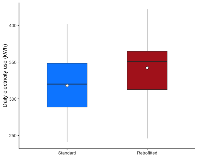
Average daily occupancy is 93.5 people in the retrofitted buildings and 59.4 in the standard ones. Figure 11.9 compares electricity use without taking that into account. Retrofitted buildings use more, 342.1 vs. 318.0 kWh per day, and a two-sample \(t\)-test calls that difference significant, \(t(58) = 2.16\), \(p = .035\). Taken at face value, the retrofits made things worse.
11.5.3 The ANCOVA
Step 0: the whole model. \(F(3, 56) = 56.61\), \(p < .001\). The model explains electricity use, so we continue.
Step 1: the interaction. The Occupancy:Type row gives \(F(1, 56) = 0.01\), \(p = .927\). We fail to reject \(H_{0,\text{int}}\): the slopes are parallel, so each additional occupant adds about the same amount of electricity in either kind of building. We drop the interaction and refit.
Step 2: the adjusted difference. Table 11.2 shows the parallel-lines model.
| Term | Estimate | SE | t | p |
|---|---|---|---|---|
| (Intercept) | 202.23 | 10.15 | 19.92 | < .001 |
| Occupancy | 1.95 | 0.16 | 12.48 | < .001 |
| TypeRetrofitted | -42.46 | 7.90 | -5.38 | < .001 |
The Occupancy coefficient is the common slope: about 1.95 kWh per day for each additional occupant. The TypeRetrofitted coefficient is \(b_2\), the estimate of \(\beta_2\), the adjusted difference: at the same occupancy, retrofitted buildings use 42.5 kWh per day less than standard ones, \(t(57) = -5.38\), \(p < .001\). We reject \(H_{0,\text{group}}\).
Figure 11.10 shows what that coefficient measures. The adjusted means turn it into two numbers: evaluating each line at the overall mean occupancy, 76.4 people, gives 351.3 kWh per day for standard buildings and 308.8 for retrofitted ones. Their difference is \(b_2\).
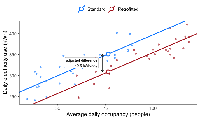
The raw comparison and the adjusted one point in opposite directions, for the same reason as in the COVID example. The groups differed in a third variable: the retrofitted buildings were busier, and busier buildings use more electricity. Compared at the same occupancy, retrofitted buildings use less electricity.
Adjusting for occupancy also shrank the error term. In the raw comparison the error mean square is 1864; in the parallel-lines model it is 508. Much of the building-to-building variation in electricity use comes from occupancy, and once the model accounts for it, that variation no longer counts as error. This is the same way repeated-measures ANOVA gains power in Chapter 8. There the known source of variation was the units themselves (the monitoring stations); here it is a measured covariate. Either way, removing it from \(MS_\text{Within}\) makes the denominator of the test smaller, so a real group difference is easier to detect.
ImportantResults reporting: ANCOVA with parallel slopes
After adjusting for occupancy, retrofitted buildings used less electricity than standard buildings, -42.5 kWh per day, 95% CI [-58.3, -26.7], \(t(57) = -5.38\), \(p < .001\). Adjusted means at the average occupancy of 76.4 people were 308.8 kWh per day for retrofitted buildings and 351.3 for standard ones. The occupancy × building type interaction was not significant, \(F(1, 56) = 0.01\), \(p = .927\), so a common slope was used (1.95 kWh per day per occupant).
11.6 Chapter Summary
Why it matters. Environmental relationships rarely play out identically everywhere. ANCOVA is the tool for a specific, recurring question: does a continuous relationship, like pollution’s effect on some outcome, hold the same way across different groups, or change from one group to the next?
Core ideas
- ANCOVA is regression plus a categorical factor. It takes the familiar \(y=\beta_0+\beta_1 x+\varepsilon\) line and lets a categorical grouping shift the intercept, the slope, or both, using the same indicator-variable machinery that underlies every linear model in this book.
- Check the whole model, then the interaction. If the whole-model \(F\) is not significant, stop. Otherwise test whether the groups’ slopes differ (\(H_0:\beta_3=0\)). That answer decides how everything else gets interpreted.
- A significant interaction means report the two lines, not one number. If slopes differ, describe how the relationship changes by group instead of reducing it to a single adjusted-mean comparison, which assumes parallel lines. Test each group’s slope with its own regression, since the interaction only says the slopes differ from each other.
- If slopes are parallel, compare adjusted means. Drop the interaction term and test \(\beta_2\), the gap between the parallel lines. When the groups differ on the covariate, the adjusted comparison can point the opposite way from the raw one, as it did for the retrofitted buildings.
- A covariate also shrinks the error term. Variation the covariate explains leaves the error mean square, which is the same way repeated-measures ANOVA gains power by removing unit-to-unit variation.
- Center the covariate when the intercept should mean something. Left uncentered, the intercept describes the groups at covariate = 0, a value the data may never actually contain.