# Boxplot for bird density by area type
ggplot(data, aes(AreaType, BirdDensity)) +
  geom_boxplot() + theme_classic(base_size=12) +
  labs(title = "Bird Density by Area Type", x = "Area Type", y = "Bird Density")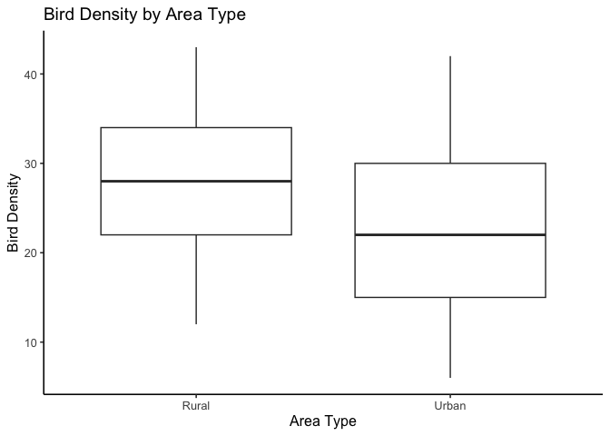
ANCOVA uses the same linear model ideas from regression, with one continuous covariate and one categorical factor. We first test whether groups have different slopes with respect to the covariate, then, only if slopes are parallel, we test whether groups differ in adjusted means.
Going deeper. T-tests, ANOVA, regression, and ANCOVA are all special cases of one underlying framework, the general linear model. Seeing that unification — and the indicator (dummy) variable mechanics that make it work — is genuinely useful, but it’s a level of abstraction that belongs in a second statistics course, not a first one. If you want to go there, see the out-of-sequence chapter “The Linear Model Framework: Dummy Variables and Interactions” in this book’s repository.
As we’ve explored statistical modeling, we’ve understood the power of both regression and ANOVA. Now, let’s merge them. ANCOVA allows us to examine relationships across different categories.
Consider these questions that may arise in environmental research:
Are dbh (Diameter at Breast Height) and height related similarly for tulip poplars and oaks?
Are biomass and BTUs (British Thermal Units) related similarly for corn stover and Miscanthus?
Does the exposure to PFAS correlate with the lifetime incidence of cancer uniformly across low- and high-income American populations?
This specific subsection of general linear models is known as Analysis of Covariance – ANCOVA. ANCOVA is a linear model with one continuous covariate and one categorical factor; it tests group differences after adjusting for the covariate and, first, whether slopes differ across groups.
At its core, ANCOVA checks whether groups share the same line, or whether each group needs its own slope and intercept. That’s exactly what the interaction test below is doing — so keep the picture of “one shared line vs. two separate lines” in mind as we go.
A few key terms help clarify how variables play different roles in linear models:
Fixed factor: A categorical variable with specific, intentional levels chosen by the researcher.
Example: comparing plant growth across seasons (spring, summer, autumn, winter). Each season is a fixed, predefined category of interest.
Random factor: A categorical variable whose levels represent a random sample from a larger population.
Example: if tree plots are randomly selected from many possible sites, “plot” is a random factor because it reflects sampling variation rather than a treatment.
Covariate: A continuous variable that changes alongside the response variable and helps explain part of its variation.
In environmental studies, common covariates include temperature, rainfall, soil moisture, or pollution concentration—factors that may influence the outcome but are not the main treatment of interest.
The purpose of including a covariate is to adjust for its influence, allowing a clearer test of the categorical effects once that continuous background variation is accounted for.
Analysis of Covariance (ANCOVA) extends ANOVA by adding a continuous predictor. It fits a linear model with both a categorical factor and a covariate, allowing us to compare groups and account for how the response changes with the continuous variable.
The covariate may or may not be the main factor of interest. Sometimes we adjust for it, and sometimes we want to see whether its relationship with the response differs across groups.
Two reasons people reach for ANCOVA. If you look this test up elsewhere, you’ll often see it introduced differently than we’re introducing it here — worth knowing both versions exist:
Both are the same test, mechanically. The difference is which term you actually came to interpret.
For ANCOVA, you need:
Why this matters. ANCOVA asks two questions in order. First, do groups have the same slope for the covariate–response relation. Only if slopes are the same do we ask whether groups differ in adjusted means after controlling for the covariate.
Model. For one covariate (x) and a two-level group indicator \(g\in{0,1}\),
\(y=\beta_0+\beta_1 x+\beta_2 g+\beta_3(x\times g)+\varepsilon .\)
Step 1: Slopes equal across groups? This tests whether the covariate effect is the same in each group.
Interpretation if rejected. Report the two fitted lines and describe how the slope differs by group. Do not test adjusted means, because the idea of a single adjusted mean per group assumes parallel slopes.
Step 2: Adjusted means equal? (only if Step 1 retained parallel slopes) Fit the model without the interaction,
\(y=\beta_0+\beta_1 x+\beta_2 g+\varepsilon .\)
What the parameters mean.
Intercepts and centering. Intercepts are evaluated at \(x=0\). Compare intercepts only if you center the covariate, for example \(\tilde x=x-\bar x\), so that the intercepts represent group means at the average covariate value.
What to report.
Common pitfalls.
When we run an ANCOVA, the output includes an omnibus F-test—a single test of whether there are any differences in the adjusted group means after accounting for the covariate.
If this test is significant, we reject the overall null hypothesis that all adjusted means are equal.
What happens next: A significant omnibus test tells us that at least one group differs, but it doesn’t tell us which groups differ or why.
To interpret the result, we must decompose the omnibus effect into its components:
Interaction (slope difference): Are the slopes of the covariate–response relationship the same across groups?
Adjusted means (intercept difference): If the slopes are equal, do the groups still differ in their adjusted means?
This two-step logic—testing slope equality first, then adjusted means—is central to ANCOVA and parallels how we follow a significant ANOVA with post-hoc comparisons.
Interpreting the Findings:
Rejecting the omnibus null indicates that the categorical factor affects the dependent variable after controlling for the covariate.
However, as always, statistical significance does not guarantee ecological or practical importance. The results should be interpreted in light of the study’s design, measurement precision, and the size of the observed effects.
ANCOVA ASSUMPTIONS
Imagine we’re environmental scientists studying the impact of air pollution (a continuous variable) on bird species density (our dependent variable).
We want to know whether this relationship differs between urban and rural areas (our categorical variable).
For this purpose, we’ve created a synthetic dataset to model the scenario.
We’ll fit an ANCOVA model to test whether location type influences bird density after accounting for air pollution.
The categorical variable (urban vs. rural) is represented as a dummy variable, and air pollution enters as a covariate.
Research Question: Does the effect of air pollution on bird density differ between urban and rural areas?
Expectation: Air pollution will have a stronger negative effect in urban areas than in rural areas.
Omnibus (adjusted means) hypothesis After adjusting for air pollution, do urban and rural sites differ in mean bird density?
\(H_{0}: \mu_{\text{Urban, adj}} = \mu_{\text{Rural, adj}}\)
\(H_{A}: \mu_{\text{Urban, adj}} \neq \mu_{\text{Rural, adj}}\)
Here, \(\mu_{\text{Urban, adj}}\) and \(\mu_{\text{Rural, adj}}\) are the adjusted group means once the covariate (air pollution) is accounted for.
Slope (interaction) hypothesis
Does air pollution affect bird density in the same way across urban and rural sites?
\(H_{0,1}: \beta_{\text{interaction}} = 0\)
\(H_{A,1}: \beta_{\text{interaction}} \neq 0\)
A significant interaction means the slopes differ, and air pollution’s relationship with bird density depends on area type.
Intercept (baseline difference) hypothesis
If slopes are parallel (interaction not significant), do the adjusted means differ?
\(H_{0,2}: \beta_{0,\text{Urban}} = \beta_{0,\text{Rural}}\)
\(H_{A,2}: \beta_{0,\text{Urban}} \neq \beta_{0,\text{Rural}}\)
Rejecting \(H_{0,2}\) indicates an inherent group difference in bird density that is independent of pollution.
Before we look at the model results, it’s always good practice to look at the data first.
Visual inspection helps us check for broad patterns and see whether the model output later “makes sense.”
Let’s start with the response variable—bird density. This will give us a quick visual sense of whether urban and rural areas differ in their average values.
# Boxplot for bird density by area type
ggplot(data, aes(AreaType, BirdDensity)) +
geom_boxplot() + theme_classic(base_size=12) +
labs(title = "Bird Density by Area Type", x = "Area Type", y = "Bird Density")
At first glance, bird density appears higher in rural areas than in urban ones, consistent with what we might expect ecologically.
Next, check the covariate, air pollution.
If the covariate differs sharply between groups, ANCOVA will “adjust” for that difference.
If it doesn’t, group comparisons will look more like a simple ANOVA.
ggplot(data, aes(AreaType, AirPollution)) +
  geom_boxplot() + theme_classic() +
  geom_boxplot() + theme_classic(base_size=12) +
  labs(title = "Air Pollution by Area Type", x = "Area Type", y = "Air Pollution")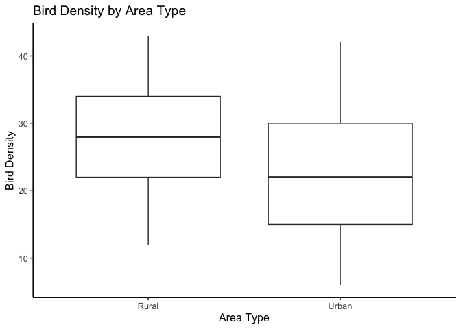
Air pollution looks fairly similar between urban and rural sites—there’s no obvious systematic difference.
This isn’t diagnostic, but it helps us anticipate what the model might show: we may find that group differences in bird density aren’t explained by pollution alone.
Now that we’ve explored the data visually, we can test our hypotheses formally using ANCOVA.
Step 1: Fit the ANCOVA model.
ancova <- aov(BirdDensity ~ AirPollution * AreaType, data = data)
| term | df | sumsq | meansq | statistic | p.value |
|---|---|---|---|---|---|
| AirPollution | 1 | 5.89 | 5.89 | 0.09 | 0.7690 |
| AreaType | 1 | 1687.99 | 1687.99 | 24.79 | 0.0000 |
| AirPollution:AreaType | 1 | 291.26 | 291.26 | 4.28 | 0.0399 |
| Residuals | 196 | 13347.09 | 68.10 | NA | NA |
Step 2: Interpret each term in light of the hypotheses
0. Omnibus (adjusted means) :
\(H_{0}: \mu_{\text{Urban, adj}} = \mu_{\text{Rural, adj}}\)
The overall ANCOVA test examines whether adjusted means differ between groups after accounting for the covariate.
Because we included an interaction term, this omnibus test is decomposed into two parts:
the interaction (slope difference), and
the main effects (covariate and group).
So we interpret the omnibus test through these individual terms rather than as a separate \(p\)-value.
1. Interaction (slope difference):
\(H_{0,1}: \beta_{\text{interaction}} = 0\)
The interaction between air pollution and area type is significant (\(p = 0.0399\)).
Reject \(H_{0,1}\) → our slopes are not parallel. Air pollution’s relationship with bird density depends on area type.
2. Covariate (main effect of Air Pollution)
Although not a formal ANCOVA hypothesis, this term tests whether air pollution predicts bird density on average, across both groups.
It is not significant (\(p = 0.7690\)), so air pollution alone does not explain much variation.
3. Group (main effect of Area Type) – \(H_{0,2}: \mu_{\text{Urban, adj}} = \mu_{\text{Rural, adj}}\)
Area type is significant (\(p < 0.001\)), suggesting lower average bird density in urban areas.
However, because the interaction is significant, this group difference changes with air pollution level, so it should be interpreted conditionally, not as a single overall difference.
Reject \(H_{0,2}\) with caution.
Step 3: Examine regression coefficients
We can also fit the same model using lm() to view the regression coefficients directly.
This shows how each term contributes to predicting bird density and corresponds to the hypothesis tests we just discussed.
ancova_lm <- lm(BirdDensity ~ AirPollution * AreaType, data = data)
| term | estimate | std.error | statistic | p.value |
|---|---|---|---|---|
| (Intercept) | 31.546 | 2.286 | 13.80 | 0.0000 |
| AirPollution | -0.043 | 0.025 | -1.75 | 0.0816 |
| AreaTypeUrban | -11.577 | 3.022 | -3.83 | 0.0002 |
| AirPollution:AreaTypeUrban | 0.067 | 0.032 | 2.07 | 0.0399 |
R automatically converts the categorical AreaType variable into a 0/1 indicator behind the scenes — it picks one level (here, “Rural,” alphabetically first) as the reference, and every coefficient involving AreaType is interpreted relative to that reference. That’s why you see a coefficient called AreaTypeUrban but no separate AreaTypeRural term.
These coefficients give the direction and magnitude of each effect:
Step 4: Visualize the interaction
As always, plotting helps confirm what the model tells us.
A scatter plot with fitted regression lines lets us see how air pollution relates to bird density for each area type.
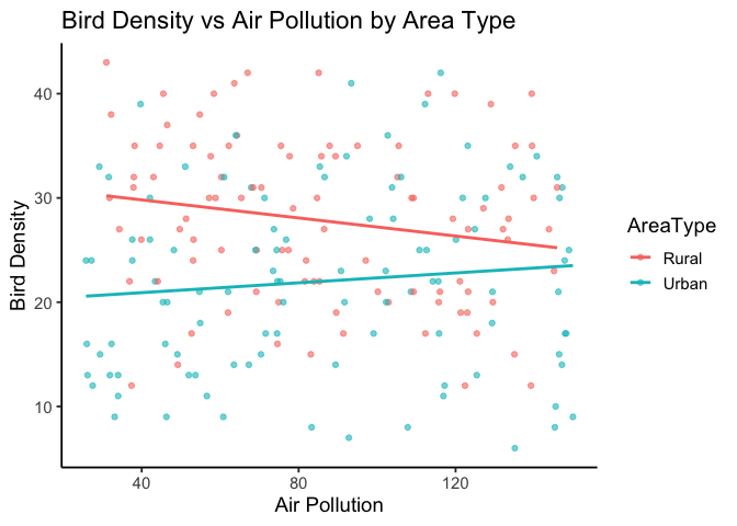
Here, the slopes differ by area type, illustrating the significant interaction we detected statistically.
You’ll also notice quite a bit of scatter around each line, which makes sense—our overall \(R^2\) is only 0.116.
Remember, \(R^2\) represents the proportion of variance in bird density explained by the model.
So, about 12% of the variation in bird density is explained by air pollution, area type, and their interaction.
The remaining 88% reflects other factors, measurement noise, or natural ecological variability not captured by this simple model.
Step 5: Centering the covariate
Interpreting intercepts at \(x = 0\) can be misleading when “zero pollution” isn’t meaningful.
By centering the covariate (subtracting its mean), we make the intercept represent average bird density at mean air pollution instead.
| term | estimate | p.value |
|---|---|---|
| (Intercept) | 27.814 | 0.0000 |
| AirPollution_c | -0.043 | 0.0816 |
| AreaTypeUrban | -5.810 | 0.0000 |
| AirPollution_c:AreaTypeUrban | 0.067 | 0.0399 |
This re-centering doesn’t change the slopes or \(p\)-values—it just shifts the intercepts, making them easier to interpret.
Interpreting the Centered Model
Centering does not change the slopes or their \(p\)-values.
Notice that the coefficients for AirPollution_c (–0.04) and AirPollution_c:AreaTypeUrban (+0.07) are identical to the slopes we estimated before centering.
Only the intercept and the AreaTypeUrban (group difference) term have changed — they are now interpreted at the mean pollution level instead of pollution = 0.
Intercept (27.8): Predicted bird density for rural sites at average air pollution.
AreaTypeUrban (–5.8): Urban sites have, on average, about 6 fewer birds than rural sites at the same mean pollution level.
AirPollution_c (–0.04): Slope for rural sites — bird density decreases slightly as pollution increases.
Interaction (+0.07): Difference in slopes between groups. The urban slope = –0.04 + 0.07 ≈ +0.03, meaning bird density increases slightly with pollution in urban areas.
Step 6: Summarize and Interpret
The significant interaction shows that air pollution’s effect on bird density depends on area type: in rural sites, bird density decreases slightly as pollution rises, while in urban sites, it increases slightly.
Because the interaction is significant, we focus on these different slopes, not on adjusted mean differences.
If the interaction had not been significant, we would instead drop the interaction term and interpret the parallel slopes model, comparing adjusted means between groups.
Our results sentences might look something like this:
Results from the ANCOVA indicated that air pollution’s effect on bird density depended on area type, F(1, 196) = 4.28, p = .0399. Bird density declined with increasing pollution in rural sites but showed a slight increase in urban sites. These findings suggest that urbanization modifies the pollution–bird density relationship and may point toward the need for area-specific conservation strategies.
Key takeaways
In this chapter, we introduced ANCOVA as an extension of ANOVA that includes continuous covariates. We began by framing ANOVA within the linear modeling framework, showing how ANCOVA builds on it by combining categorical and continuous predictors. Using examples such as bird density across urban and rural environments, we developed and tested null and alternative hypotheses step by step. The main advantage of ANCOVA is its ability to adjust for continuous variables, allowing clearer interpretation of group effects.